WriteMark
Plain Language Standard
New research uncovers the depth of the ‘no-understanding’ problem in insurance contracts

Insurance customers are often frustrated to learn the limits of their cover after an event. New research shows how deep the problem goes. Photo by Javin Rungsung | Pexels.
People working in insurance know that insurance contracts have a fundamental flaw: their customers don’t read them.
This is a problem because a contract depends on all parties agreeing to its terms. If a customer doesn’t read their policy, they can’t really agree to it. This can cause disputes, which often lead to costly court battles.
Legal scholars call this the ‘no-reading’ problem.
But the no-reading problem has a lesser-known counterpart: the ‘no-understanding’ problem. The no-understanding problem suggests that consumers who do read their contracts can’t reliably understand them.
Now, new research from the University of Michigan sheds further light on just how severe the no-understanding problem is. The authors also offer a few practical solutions.
The study tells us a few important things about how customers read insurance policies.
- Poorly written policies can be worse for readers’ understanding than no policy at all.
- Partially reading or partially understanding is its own challenge, and the standard policy structure makes it worse.
- Readers with a more sophisticated understanding of insurance may struggle just as much as ‘unsophisticated’ readers.
Not reading versus not understanding
They may be unimaginatively named, but the no-reading and no-understanding problems are important to distinguish. That’s because they have different implications.
For example, consumers can shoulder some of the blame for not reading their contract — they are part of the no-reading problem. But, if they try to read a contract and find it too hard to understand, more blame lies with the insurer.
That means the problems have different solutions, too. For example, requiring consumers to scroll to the bottom of an agreement before they click ‘I agree’ may make them more likely to read it (let’s be honest — it probably won’t). But that requirement won’t help consumers understand the agreement if it’s poorly written.
The study: can people tell if a scenario is covered?
To find out just how big the no-understanding problem is, the researchers asked 2,500 American insurance customers to work out whether seven hypothetical scenarios would be covered by a standard home insurance policy.
Respondents were split into two groups.
- The control group had to guess whether an event would be covered without referring to an insurance policy.
- The treatment group had to use an excerpt from a real-world insurance policy to work out whether the event would be covered.
Surprisingly, the treatment group did not fare much better than the control group. In fact, for two out of the seven scenarios, the group without the wording did better.
In other words, having the insurance policy in front of them actually made it harder for respondents to work out whether an event would be covered in some situations. The difficult wording was actively detrimental to their understanding of coverage.
‘While it has long been evident that most consumers do not attempt to read standard consumer forms,’ the authors write, ‘our research indicates that even when they do, they often fail to fully grasp the terms.’
What the study tells us
The researchers found that part of the problem is what they call ‘a partial-reading or partial-understanding problem’.
This problem arises when a consumer reads or understands one part of their policy, but not another part that modifies the first. For example, they might read that their house is covered against flooding, but not read or understand a relevant exclusion for retaining walls.
This incomplete understanding often leads, as you can imagine, to very unhappy customers.
The partial-reading or partial-understanding problem points to a challenge inherent in the standard structure of insurance policies. Benefits are one section; exclusions are another. Customers who give up reading on page five may not realise their home becomes ineligible for cover on page six.
But some readers are more sophisticated, right?
The researchers also broke their findings down by race or ethnicity, income, and ‘sophistication’. Sophisticated respondents were those with a higher education who claimed to have experience reading and understanding insurance policies.
This deeper analysis yielded more surprising results. These ‘sub-populations’ within both the control and treatment group all performed similarly. In other words, even people who thought they had a good grasp of insurance found it hard to tell if a scenario would be covered.
These findings may be a bit of a reality check for some insurers. We often hear that insurance companies know they have a sophisticated or specialist audience. But, according to this study, we can’t assume that more educated or wealthy customers will be more likely to understand a complex policy wording.
What we can do with this information
The authors also suggest a range of possible solutions for lawmakers and regulators. They could impose readability standards on insurers. They could also look to AI. ‘Smart readers’ using generative AI tools like Chat GPT could create simple summaries of cover.
Finally, insurers could make extra effort in the policy wordings themselves to solve understanding problems, like adding contextual ‘warnings’ throughout the text. These would be eye-catching messages designed to:
- address common misunderstandings
- remind readers that they may have an incomplete understanding if they don’t read a whole section.
It may go without saying, but we see the WriteMark® as part of the solution, too. Readability requirements across 25 criteria — from big picture to language and presentation elements — all make insurance policies easier to understand.
For insurers, the overall lesson of this research is simple: there’s no point getting customers to read your policy if they won’t understand it.
Ryan Tippet April 28th, 2025
Posted In: Plain language, The WriteMark
Tags: consumers, insurance policies, Insurance writing, Legal documents, research
New laws give Kiwi insurers 3 years to adopt plain language in their policies

New laws passed in Parliament set nationwide rules for insurers to use plain language in their contracts. Image by Leroy de Thierry / Unsplash Licence.
The Contracts of Insurance Act 2024 and a related Repeals and Amendments Act passed into law in November last year.
In the words of Insurance Council of New Zealand chief executive Kris Faafoi, the Acts tidy up a ‘mishmash of outdated insurance laws’ and bring them into the 21st century.
What’s new in the new laws
The headline for insurers is that the new laws give them 3 years to make a raft of updates to their policies and processes.
Most of the changes are about making life easier for individuals with ‘consumer’ insurance — like life, home, contents, and car insurance.
Of particular relevance for the WriteMark® are requirements to:
- ensure all contracts are ‘clear, concise, and effective’
- inform policyholders more precisely about their disclosure responsibilities.
Clear wording to clarify ‘rights and obligations’
The plain language requirements take effect as amendments to the Financial Markets Conduct Act 2013. A new insertion specifies that insurers must write and present contracts in a ‘clear, concise, and effective manner’.
The legislation doesn’t elaborate on exactly what ‘clear, concise, and effective’ means, except to clarify that ‘concise’ doesn’t mean entire documents have to be short — just that ‘particular terms’ can’t be excessively wordy.
But the emphasis is clearly on making life easier for everyday Kiwis trying to navigate the complexity of insurance. Insurers will know they’ve succeeded if the wording and presentation ‘assist consumers to understand their rights and obligations’.
The use of ‘worded and presented’ suggests that not only text but design elements (like font size, line length, and colour contrast) are also factors.
These new requirements make the WriteMark® more urgently relevant for insurers than ever before. Achieving the WriteMark® on insurance policies does two things.
- It offers a clear 25-point framework for rewriting in plain language.
- It demonstrates to both consumers and regulators that a policy is ‘clear, concise, and effective’.
Contact us to discuss getting the WriteMark® on insurance policies
Existing disclosure rules create headaches for consumers
The biggest changes in the Contracts of Insurance Act — at least for everyday consumers — concern policyholder disclosures.
When someone buys an insurance policy, they have to share a range of details about their life and circumstances. Insurers use this information to work out the terms of the contract they’re willing to offer.
The kinds of information consumers must share has been, historically, a bit loose. This made it hard for people to know exactly what information their insurer considered relevant. And that could later allow insurers to decline claims because they didn’t have the right information when they agreed to the contract.
Long story short: it wasn’t great for consumers.
The new laws shift the onus to insurers
Under the new laws, insurers have more responsibility to gather the right information using clear questions in familiar terms. If they don’t get the right information, it’s still their responsibility to follow up before entering a contract.
This shifts much of the onus of disclosure from policyholders to insurers. As Commerce and Consumer Affairs Minister Andrew Bayly put it, ‘Consumers will no longer have to rack their brains and guess what information is relevant to their insurance policy’.
Again, plain language is vital here. Insurers need to phrase their questions using simple and unambiguous terms to get the information they need. It’s on them to get the wording right; regulators are unlikely to side with insurers if policyholders find disclosure questions confusing.
For their part, policyholders must ‘take reasonable care not to make a misrepresentation’ — a slightly hideous phrase that means they have to do their best to ensure their answers are correct.
If you’ve got a few spare hours, you can read the full text of the Acts online.
View the Contracts of Insurance Act 2024
View the Contracts of Insurance (Repeals and Amendments) Act 2024
Ryan Tippet February 13th, 2025
Posted In: The WriteMark
Understanding the WriteMark® design guidelines

Follow the WriteMark design guidelines to create clear, welcoming documents that your readers will love. Image by Sarah Pflug / Shopify licence
One of the criteria we use to evaluate documents is actually a bundle of requirements in one question: ‘Does the document meet the WriteMark® design guidelines?’
What are the design guidelines? Why are they important? And how can a document meet them? Today’s blog walks you through the design guidelines and explains why they’re part of the WriteMark® Plain Language Standard. Click the link below to see the design guidelines for yourself.
Download the WriteMark® design guidelines
The design guidelines ensure a document looks clean, clear, and accessible
The WriteMark® design guidelines cover four main areas, which we’ll explore in detail below.
- Text and headings
- Spacing and margins
- Graphics and colour
- Navigation
The guidelines ensure documents are inviting and easily legible. They favour simplicity over complexity, and support a clean, open, and accessible reading experience (without compromising brand look and feel).
Like the text and ‘big picture’ elements of the WriteMark®, the design guidelines prioritise the reader. They create a reading experience that aids navigation and understanding. Most importantly, they make documents work for the widest possible audience, by ensuring vision-impaired readers can access and use them.
However, the WriteMark® design guidelines are not a comprehensive resource for creating accessible documents.
Check out our blog posts on accessibility for more tips
Text and headings — ensure fonts are legible and headings aid navigation
The text elements of the WriteMark® design guidelines are mostly satisfied by choosing an easy-to-read typeface and a clearly legible font size. ‘Easy-to-read’ is slightly subjective, but as long as it’s not too light, narrow, or heavy — and you minimise bold, italics, and capitals — it should meet the standard.
The actual size of text, and how easy it is to read, depends on the typeface you choose. We usually recommend a 10-point minimum font size, but some typefaces may need to be bigger or smaller.
Headings help readers skim-read to find the information they need. To do this, they need to be formatted in a clear hierarchy (for example, top-level headings are the biggest, then second-level headings, and so on). Font size, weight, and colour can all work to distinguish different heading levels. Italics and underlining can work too, if needed.
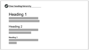
Use a clear heading hierarchy to show the relationship between different sections and subsections in text. Image by Write Limited
The spacing above and below headings should put them closer to the paragraph they introduce, rather than ‘floating’ equally between the text before and after.
Finally, avoid ALL-CAPS and Title Case in headings — sentence case is easier on the eyes.
Spacing and margins — use white space to create an inviting layout
As readers, our eyes are drawn towards a roomy layout with plenty of white space (meaning parts of the page with nothing on them). On the other hand, a dense ‘wall of text’ looks and feels like a struggle to read. These can drive readers away.
To achieve a spacious layout:
- use generous margins and spacing to create white space around your text
- use ample and consistent spacing between lines and paragraphs.
A 2.5cm or more margin is good for printed documents. Microsoft Word uses 2.54cm margins (or 1 inch) by default.
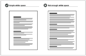
Wide margins and generous spacing create ample white space. A page without enough white space looks cluttered and feels like a chore to read. Image by Write Limited
Comfy margins, spacing, and font size should also create a readable line length. Line length is the number of words or characters on each line of text. We recommend aiming for 45–75 characters per line for printed text. Longer line length can look and feel like a chore to read.
Use spacing to show the relationship between different elements on the page
You can also use spacing to support navigation. Readers automatically recognise a kind of ‘layout language’ created by grouping and aligning certain elements. Use spacing to reinforce elements that are connected, and create breaks between elements you want to separate.
More specifically, our design guidelines recommend you:
- use line spacing to visually group bullet lists with the text that introduces them
- align images with margins, and place them close to relevant text and explanations.
Graphics and colour — choose images that support text and use contrasting colours
If your document includes graphics, make sure they clearly support or clarify the text. Graphics that are only tangentially related to the text can throw readers off-course. Check that graphics have the necessary captions, titles, or labels as appropriate.
Graphics need to be easily legible without zooming or squinting. Consider the different ways readers will encounter your graphics (for example, printed or online), and make sure they are large and clear enough across all of the options.
To accommodate visually impaired readers, make sure graphics have either:
- alt text — short descriptions for simple photos and illustrations
- long descriptions — detailed explanations of complex elements, like graphs.
Check that the colours you use have a strong enough contrast to be easily legible. If colours are too similar, some elements become difficult to read — especially for colour-blind readers. Use a tool like Colour Contrast Analyser to check your colours, and be aware that smaller fonts need higher contrast.
Download Colour Contrast Analyser
Navigation — create well-defined sections and include a table of contents
Finally, use design to help readers navigate through your document.
We’ve mentioned already how heading hierarchy and spacing can help readers understand the relationship between sections and subsections in a document. Here are some more tips to improve navigation.
- Make each new section obvious (consider a page break if space allows).
- Include a table of contents for documents longer than two or three pages.
- Make sure the table of contents has ‘leader lines’ between the section heading and page number.
- Check that all links in digital documents work, including in the table of contents.
Trust your gut
Our final tip is not written in the design guidelines: trust your gut!
Implementing great design takes skill and experience. But recognising good design is something anyone can do.
Put yourself in your reader’s shoes. Take a step back and look at your document — does anything look unbalanced, or busy? Is your eye drawn where it needs to go? Does the density of text feel light and digestible, or does just looking at it make you want to close the window and take a coffee break?
Your own reaction is instructive, because it may indicate how other readers will respond to your document’s layout.
Follow the design guidelines — and trust your gut!
Download the WriteMark® design guidelines
Ryan Tippet July 9th, 2024
Posted In: The WriteMark
Tags: accessibility, clear communication, clear thinking, clear writing, design, design guidelines, guidelines, plain language, Quality writing, the WriteMark, WriteMark
Three reasons to get the WriteMark® on shorter documents

We’d love to help you achieve the WriteMark on the whole library of documents you use to communicate with customers | Photo by Niklas Ohlrogge on Unsplash.
Most documents that hold the WriteMark® are on the longer side. Achieving the Standard takes time and effort. That time and effort feels better spent when — at the end of it all — you can proudly display the WriteMark® logo on an important 100-page document, rather than an everyday 1-pager, right?
But which of your public-facing documents do people look at most often? Which do you think your customers are more likely to read from start to finish?
You’ll get the best value out of the WriteMark® by achieving the Standard and displaying the logo on the documents that are most important to your readers. We’re willing to bet they’re not always your longest.
Here are three reasons why the WriteMark® is right for shorter documents.
1. Short documents often leave a bigger impression on your readers
Consider which of your public-facing documents are the most important to you, and which are the most important to your readers. Are they the same documents? Or are you overlooking other documents that have more impact on your customers’ experience?

Your longest documents might seem the most important, but readers often spend more time and engage more deeply with short, everyday documents |Photo by Beatriz Pérez Moya on Unsplash.
For example, lots of insurance product disclosure statements in New Zealand hold the WriteMark®. A product disclosure statement (PDS) is the main policy document that sets out all the benefits, exclusions, terms, and conditions of cover. It’s an important document for both insurers and their customers.
But many customers will never read their PDS cover to cover. They’ll dip into a few sections as and when they need them. Making the PDS as clear as possible is still vital, but it’s unlikely to be the document that insured customers spend the most time with.
Instead, those customers spend more time on shorter documents: things like policy schedules, application forms, renewal letters, claims processes, websites, and correspondence. These ‘satellite’ documents may seem less important, but they’re the ones customers are actually reading. As a result, they play an outsized part in building confidence and trust.
That’s why getting short documents right can make a big difference, and leave a bigger impression.
2. WriteMark® requirements make short documents focused and functional
The WriteMark® Standard has 25 requirements, ranging from the ‘big picture’ (things like smart structure and clear purpose) to the minute details of language and presentation. Some of these 25 requirements won’t apply to short documents — this makes them easy to meet!
But for many short documents, the WriteMark® requirements can help you consider improvements you might otherwise overlook.
For example, you might think:
- structure is less important when all your information fits on one page
- headings aren’t needed for a document of only a few paragraphs
- a bullet list is unnecessary when you’re only asking a reader to fill out a form.
But following the WriteMark® requirements for structure, headings, and bullet lists — among other things — hones short documents to make them their best, punchiest, most practical versions:
- A smart structure ensures you deliver information in a logical order, so readers build their understanding and know what to do.
- Headings summarise key messages, clarifying purpose and supporting navigation.
- Bullet lists enable readers to scan information easily and create extra white space.
All these elements make long documents simpler and more functional, but here’s the secret: they work for short documents too!
3. Customers expect consistent quality across the documents they read
Displaying the WriteMark® on your biggest documents is a visible commitment to caring about your customers. Adding it to the surrounding constellation of shorter documents creates consistency in your brand values across all your communications.
Customers expect consistency from the businesses and organisations they deal with — even subconsciously. A poorly written webpage or letter template will stand out like a sore thumb. One complex and ambiguous communication can undermine the caring and conscientious brand value reflected in the WriteMark®.
If you can make something as complex as an insurance PDS clear, why leave a claims form or FAQs page in the dense and ambiguous Dark Ages? Achieving the WriteMark® on shorter documents signals a consistent, clear tone across the whole array of interactions you have with your customers.
We can assess short documents in batches, so the WriteMark® is more cost-effective
If you’re concerned about the cost, we can work out a deal. Because it doesn’t take as long to assess short documents, we’re often happy to do them in batches.
This makes it even more cost-effective to achieve the WriteMark® for your ‘daily drivers’ — those short, significant documents that your readers encounter every day.
We’d love to help you get the WriteMark® on your library of short documents. Contact us today to discuss your documents, your readers, and to get a quote.
Send us some information about your short documents and we’ll be in touch
Ryan Tippet June 12th, 2024
Posted In: The WriteMark
Tags: clear communication, financial documents, Insurance writing, Legal documents, WriteMark
Why the WriteMark® matters more than ever in the age of AI writing

Photo by cottonbro studio / Pexels licence
One of our favourite plain language mottos adorns the wall in massive text at Write’s Wellington office. It’s from Sir Ernest Gowers’ book, Plain Words: ‘Be short, be simple, be human’.
It’s a motto that follows its own advice.
In the burgeoning age of ‘AI’ text generation, human writing for human readers is more important than ever. And that makes the WriteMark® an even more valuable symbol of people-centric plainness.
Here’s why a quality mark for clear communication matters even more in the age of AI.
People-centric writing stands out in an AI-generated torrent
The WriteMark® has always been a way to show your readers you care.
The heart-shaped symbol demonstrates your commitment to being clear, open, and customer-focused. It signals to your audience that you’ve gone the extra mile to ensure they understand what you’re telling them, which builds trust and confidence.
We think readers will particularly appreciate the WriteMark’s® quality promise as AI writing proliferates. AI-generated text risks ‘infecting’ AI training data — the library of information that AI tools use to create their responses. This may degrade the quality of AI outputs over time, as they reinforce and amplify their own distortions and biases. Commentators have called this an ‘AI ouroboros’
Read about the ouroboros on Medium’s website
In this uncertain future of AI writing, the WriteMark® will signify people-centric writing that gives readers confidence and helps to form human connections between author and audience.
Our human assessors give human insights
In a WriteMark® assessment, qualified experts read documents, assess them against 25 carefully selected criteria, and produce a report packed with insights and recommendations. They apply a critical eye, drawing on their experience and understanding — as both writers and readers — to identify what works and what needs work. This experience and insight helps to shape documents that serve their writers — and their readers.
AI can do some incredible things, if you know how best to use it. By drawing from untold libraries of human writing and thought, it can generate convincing text and images in the blink of an eye. It can educate and entertain, adapting its tone and language for any conceivable audience. But AI is not critical, creative, or insightful — not yet.
Big-picture elements require critical thought
AI can provide lots of helpful advice for some of the more mechanical aspects of plain language, like sentence structure and word choice. But humans can still do a few things better — like thinking.
‘Artificial intelligence’ is a bit of a misnomer, because tools like ChatGPT and DALL·E 3 are not thinking or creating. They draw on vast sets of training data from the web and use predictive patterns to spit out realistic answers to prompts.
This means AI would struggle to meet or assess some WriteMark® criteria, especially big-picture elements. It takes critical thought to determine whether a document has:
- a clear purpose
- an overall structure that helps readers to understand it
- answers to all the questions a reader is likely to ask.
AI is improving constantly, and quickly. But answering these questions requires critical analysis and holding the ‘big picture’ in mind — skills that today’s AI tools can only imitate.
AI can be a cultural liability
Our assessors have another advantage over AI tools — their Kiwi cultural context and sensitivity.
AI tools draw on training data from all corners of the internet. This means they tend to replicate and reinforce existing biases in that data. Aotearoa New Zealand represents a tiny corner of the internet, so our cultural differences are easily overwhelmed by American and European norms in AI’s predictive patterns.
Why does this matter? One element we assess for the WriteMark® is whether the document has an appropriate style and tone for its audience. Aotearoa’s cultural context is different from the rest of the world in lots of small ways — as well as the big ones, like the role of te reo and te ao Māori. The words we use and the way we express ourselves are distinct, as are our history, economy, politics, and culture.
AI tools are liable to get these small things wrong, because they draw from the wilderness of the World Wide Web. As well as setting the wrong ‘style and tone’ for our specific cultural context, relying on AI can lead to embarrassing and even offensive errors.
The WriteMark® Plus gives unrivalled insight into how readers experience a document
On top of using human experts to assess documents for the WriteMark, we get human non-experts to test how well a document serves its readers for the WriteMark® Plus.
User-testing with real readers always uncovers unforeseen sticking points. Human testers can help identify things like:
- whether a certain word choice or section is confusing
- whether a document’s structure matches readers’ expectations
- whether a document is accessible to readers of all abilities
- whether a document is practical to use in the real world.
AI is clever, and convincing. But there’s simply no substitute for testing a document with its target audience.
AI can be a powerful plain language tool — learn how to use it safely
While human expertise can’t be beaten when it comes to the high standard of the WriteMark, we still recognise the value of this powerful tool.
That’s why Write has added an Write smarter with AI workshop to our roster, and why we’re keeping up to date with advances in the field.
Check out our workshop, Write smarter with AI
Read our blog post about how to get the most from AI
Ryan Tippet February 12th, 2024
Posted In: Plain English, Plain language, Plain Language Awards, The WriteMark, WriteMark Plus
Tags: AI, AI Writing, clear communication, clear language, clear thinking, clear writing, plain language, power of plain language, Quality writing, the WriteMark, WriteMark, WriteMark Plus
How does the WriteMark® compare to a new international standard?

We’ve mapped out how the WriteMark sits next to the new ISO Standard. We wanted to be sure our mark of plain language quality aligns with international best practice. And we wanted to understand where and why the two standards differ | Photo by Alexander Suhorucov on www.pexels.com
In June 2023, the International Organization for Standardization, or ISO, released Part 1 of its first-ever Plain Language Standard. The ISO Standard offers guidelines for writing in plain language, arranged around four organising principles. These establish that information should be relevant, findable, understandable, and usable.
Read our blog about the ISO Standard over on the Write website
How does the WriteMark® Plain Language Standard, developed here in Aotearoa New Zealand, compare to the new international standard? Do the two standards have any disagreements?
If your document holds the WriteMark®, does it also meet the criteria in the ISO Standard?
Is the WriteMark® keeping pace with international best practice?
Let’s answer those questions one by one.
Comparing the WriteMark® to the ISO Standard
As we pointed out in our blog post on the Write website, the ISO Standard doesn’t include quantitative measures. It doesn’t give users a way to certify documents that ‘meet the standard’.
So, right off the bat, the ISO Standard does something quite different from the WriteMark®.
The WriteMark® logo shows that we have assessed a document and we recognise its excellence in clarity and presentation. The WriteMark® uses 25 criteria to evaluate whether or not a document or website meets a high standard of plain language.
But although they have different purposes, the guidelines in the ISO Standard broadly align to the criteria in the WriteMark®.
Here’s an example.
- Guideline 5.2.4(a) in the ISO Standard says to ‘Use a new heading when introducing a new topic’.
- To achieve the WriteMark®, a document must have ‘useful, informative headings to guide the reader’.
The ISO guideline is more specific, but the WriteMark® requirement captures the same intent.
Many of the ISO Standard guidelines go into more detail than the WriteMark® criteria. The WriteMark® simply asks if a document’s structure is ‘clear and logical to the reader’. The ISO Standard, in comparison, recommends:
- placing the most important information first
- separating supplementary information
- presenting instructions in chronological order
- and several more specific guidelines.
These guidelines are all part of a ‘clear and logical’ structure. The guidance in the ISO Standard and requirements of the WriteMark® aren’t at odds — they’re doing different things, at different levels of detail.
The ISO Standard emphasises a different purpose
The ISO Standard and the WriteMark® do, however, place emphasis in different areas. These differences are worth exploring.
The first area is the document’s ‘purpose’. For the WriteMark®, a document needs to have a clear purpose, and its content needs to support that purpose.
Makes sense, right? We know that documents are most effective when they’re written with a clear goal in mind.
The ISO Standard, however, strongly emphasises the purpose of the reader. Writers should identify their reader’s purpose for reading their document, and put their readers’ needs first.
This also makes a lot of sense! Clear plain language documents put their readers first.
So which perspective is correct? Successful documents will fulfil both their readers’ and writers’ purposes. They’ll achieve what their author needs them to, while being entirely transparent and practical for readers to use.
The question is whose purpose is front of mind, and when. And that will depend on your document, your audience, and, of course, your own purpose for writing.
We explore this question further in another blog on the Write website:
Comparing the ISO Standard to the Plain Language Act and Write Plain Language Standard
The ISO Standard brings elements together under an umbrella of ‘cohesive’ writing
Another distinction between the ISO Standard and the WriteMark® is in the idea that documents are ‘cohesive’.
The third principle of the ISO Standard, ‘understandable’, covers what we often think of as ‘language elements’. This means using familiar words, short and active sentences, concise paragraphs, and a reader-friendly tone.
The ISO Standard then collects these elements, along with the structure and headings from the principle of ‘findable’, under an overall direction to ‘Ensure that the document is cohesive’.
This means, in short, make sure all the parts of the document work together. They have clear and consistent relationships. They all serve a common purpose.
Unlike the ISO Standard, the WriteMark® doesn’t have any one particular requirement for documents to be cohesive.
We’re already looking at how the elements of a document cohere throughout the WriteMark® process. In a WriteMark® assessment, we are checking that the words have a cohesive tone, that the structure presents a cohesive whole, and that the presentation elements are consistent and appropriate.
The guidance to write cohesive documents is handy, but as a requirement in the WriteMark® it would only duplicate other elements we’re already assessing.
Does a WriteMark® document meet the ISO Standard?
A document can’t ‘meet the ISO Standard’, because the ISO Standard is a set of guidelines, not requirements. But let’s put that technicality aside and rephrase the question in a way that we can answer:
Does a WriteMark® document have the same quality of plain language as a document developed using the ISO Standard guidance?
To that we can confidently say, ‘yes’. Documents that achieve the WriteMark® will also satisfy the ISO Standard’s organising principles. WriteMark® documents are all different, but each one is:
- purposeful and reader-focused to ensure information is relevant
- organised and structured to make information easy to find
- welcoming and clearly written to make information easy to understand
- practical and concise to make information easy to use.
And this relationship goes both ways. If you follow the guidelines in the ISO Standard, you’ll develop a document that’s well on its way to meeting the WriteMark®.
Again, we can find some differences in the details, but the two standards are well aligned overall.
For example, to achieve the WriteMark®, a document must use mostly positive sentences. The ISO Standard doesn’t mention positive or negative sentences — possibly because it applies across languages, not just English. But its instructions to write concise sentences with a clear structure will ensure they are also mostly positive.
Updating the WriteMark® to keep pace with international best practice
We want to be certain that the WriteMark® reflects the best practice in plain language, which means updating it from time to time. The ISO Standard finally arriving after years in the making has been a good prompt for us to make some tweaks.
Following the emphasis in the ISO Standard, we’ve added a cue to the WriteMark® assessment to note a document’s purpose and audience. This gets us and our clients thinking about the ISO Standard principle of ‘relevant’.
It’s a reminder to consider:
- who you’re writing for
- your readers’ context when encountering your document
- what you and your readers hope to achieve with this document.
We’ve also added a reminder to the assessment about making documents cohesive. This notes that a document is cohesive if its language, presentation, and big picture elements all support its purpose and the purposes of its readers.
And we took this opportunity to align the wording in some of the WriteMark® criteria more closely with Write’s Plain Language Standard, just to keep things tidy.
More resources
Download Write’s Plain Language Standard for free
Learn about the WriteMark® criteria and assessors
Buy a copy of the ISO Plain Language Standard
Ryan Tippet July 3rd, 2023
Posted In: Plain language, The WriteMark
Tags: clear communication, guidelines, industry standards, International Organization for Standardization, ISO, ISO Standard, plain language, Quality writing, the WriteMark