WriteMark
Plain Language Standard
Why the WriteMark® matters more than ever in the age of AI writing

Photo by cottonbro studio / Pexels licence
One of our favourite plain language mottos adorns the wall in massive text at Write’s Wellington office. It’s from Sir Ernest Gowers’ book, Plain Words: ‘Be short, be simple, be human’.
It’s a motto that follows its own advice.
In the burgeoning age of ‘AI’ text generation, human writing for human readers is more important than ever. And that makes the WriteMark® an even more valuable symbol of people-centric plainness.
Here’s why a quality mark for clear communication matters even more in the age of AI.
People-centric writing stands out in an AI-generated torrent
The WriteMark® has always been a way to show your readers you care.
The heart-shaped symbol demonstrates your commitment to being clear, open, and customer-focused. It signals to your audience that you’ve gone the extra mile to ensure they understand what you’re telling them, which builds trust and confidence.
We think readers will particularly appreciate the WriteMark’s® quality promise as AI writing proliferates. AI-generated text risks ‘infecting’ AI training data — the library of information that AI tools use to create their responses. This may degrade the quality of AI outputs over time, as they reinforce and amplify their own distortions and biases. Commentators have called this an ‘AI ouroboros’
Read about the ouroboros on Medium’s website
In this uncertain future of AI writing, the WriteMark® will signify people-centric writing that gives readers confidence and helps to form human connections between author and audience.
Our human assessors give human insights
In a WriteMark® assessment, qualified experts read documents, assess them against 25 carefully selected criteria, and produce a report packed with insights and recommendations. They apply a critical eye, drawing on their experience and understanding — as both writers and readers — to identify what works and what needs work. This experience and insight helps to shape documents that serve their writers — and their readers.
AI can do some incredible things, if you know how best to use it. By drawing from untold libraries of human writing and thought, it can generate convincing text and images in the blink of an eye. It can educate and entertain, adapting its tone and language for any conceivable audience. But AI is not critical, creative, or insightful — not yet.
Big-picture elements require critical thought
AI can provide lots of helpful advice for some of the more mechanical aspects of plain language, like sentence structure and word choice. But humans can still do a few things better — like thinking.
‘Artificial intelligence’ is a bit of a misnomer, because tools like ChatGPT and DALL·E 3 are not thinking or creating. They draw on vast sets of training data from the web and use predictive patterns to spit out realistic answers to prompts.
This means AI would struggle to meet or assess some WriteMark® criteria, especially big-picture elements. It takes critical thought to determine whether a document has:
- a clear purpose
- an overall structure that helps readers to understand it
- answers to all the questions a reader is likely to ask.
AI is improving constantly, and quickly. But answering these questions requires critical analysis and holding the ‘big picture’ in mind — skills that today’s AI tools can only imitate.
AI can be a cultural liability
Our assessors have another advantage over AI tools — their Kiwi cultural context and sensitivity.
AI tools draw on training data from all corners of the internet. This means they tend to replicate and reinforce existing biases in that data. Aotearoa New Zealand represents a tiny corner of the internet, so our cultural differences are easily overwhelmed by American and European norms in AI’s predictive patterns.
Why does this matter? One element we assess for the WriteMark® is whether the document has an appropriate style and tone for its audience. Aotearoa’s cultural context is different from the rest of the world in lots of small ways — as well as the big ones, like the role of te reo and te ao Māori. The words we use and the way we express ourselves are distinct, as are our history, economy, politics, and culture.
AI tools are liable to get these small things wrong, because they draw from the wilderness of the World Wide Web. As well as setting the wrong ‘style and tone’ for our specific cultural context, relying on AI can lead to embarrassing and even offensive errors.
The WriteMark® Plus gives unrivalled insight into how readers experience a document
On top of using human experts to assess documents for the WriteMark, we get human non-experts to test how well a document serves its readers for the WriteMark® Plus.
User-testing with real readers always uncovers unforeseen sticking points. Human testers can help identify things like:
- whether a certain word choice or section is confusing
- whether a document’s structure matches readers’ expectations
- whether a document is accessible to readers of all abilities
- whether a document is practical to use in the real world.
AI is clever, and convincing. But there’s simply no substitute for testing a document with its target audience.
AI can be a powerful plain language tool — learn how to use it safely
While human expertise can’t be beaten when it comes to the high standard of the WriteMark, we still recognise the value of this powerful tool.
That’s why Write has added an Write smarter with AI workshop to our roster, and why we’re keeping up to date with advances in the field.
Check out our workshop, Write smarter with AI
Read our blog post about how to get the most from AI
Ryan Tippet February 12th, 2024
Posted In: Plain English, Plain language, Plain Language Awards, The WriteMark, WriteMark Plus
Tags: AI, AI Writing, clear communication, clear language, clear thinking, clear writing, plain language, power of plain language, Quality writing, the WriteMark, WriteMark, WriteMark Plus
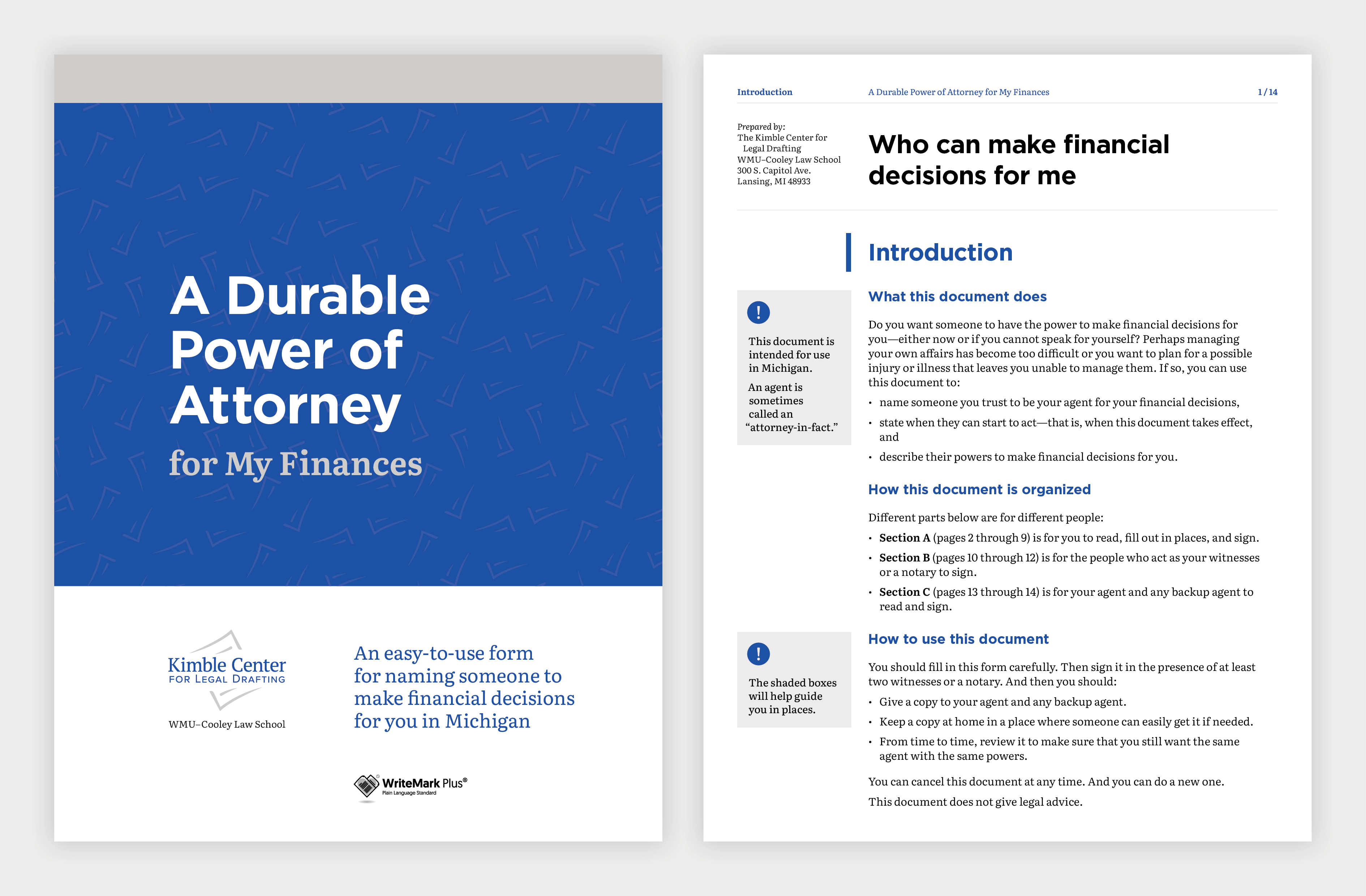
Clear legal documents give clear legal authority

Naming a power of attorney means someone else can make decisions for you if you can’t | Photo by Romain Dancre on Unsplash
We all hope we’ll always be able to make our own decisions about our finances and property. But what if we can’t?
Anyone can lose the ability to deal with their affairs through accident or illness. If nobody has the legal authority to act for you or sign documents, dealing with your affairs can be difficult and stressful for you and your family.
A durable power of attorney allows you to give someone the legal power to deal with your affairs and make decisions for you. Setting up a power of attorney means that you control who manages your affairs.
Building a library of free-to-use legal resources
The Kimble Center for Legal Drafting, based at Western Michigan University–Cooley Law School in the US, specialises in writing easy-to-understand legal documents. Their mission is to produce clear legal documents that are free for the public to use in Michigan.
The Kimble Center has published a new Power of Attorney document. People can use it to name someone they trust to make decisions about their finances if they’re not able to.
Reaching the high standard of the WriteMark® Plus
The new Power of Attorney follows the pattern of the earlier Power of Attorney for My Health Care. And it has been assessed as meeting the WriteMark® criteria for purpose, structure, content, language, and design.
Eventually the Power of Attorney for My Finances also achieved the WriteMark® Plus Plain Language Standard. The WriteMark® Plus combines an elements-based assessment with user-testing. The results of user-testing led to further fine-tuning of the content.
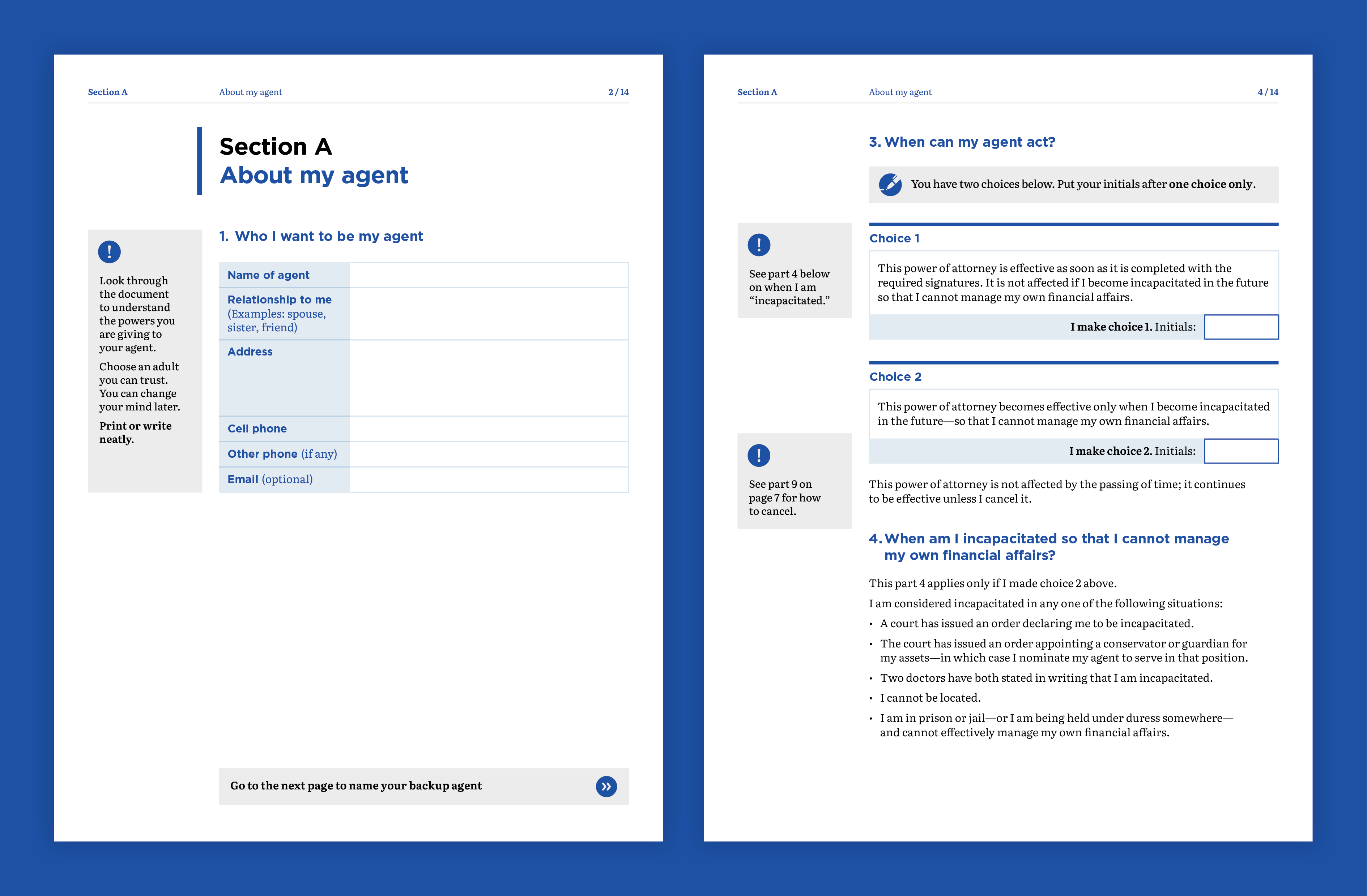
Design elements guide the user through the document | Image by Gusto Design
Using careful design to support the purpose of the document
The Kimble Center engaged the team at Gusto Design to create a design that would support clarity and accessibility.
Annette Ellis, Creative Director at Gusto, explains:
Once again, we worked with the Kimble Center for Legal Drafting to make a complex process clear and easy to understand. The plain language used in the Power of Attorney form is visually supported using design elements that guide the user through the form, making it easy for users to understand and fill out the required information.
Instructions are provided as shaded boxes adjacent to the form fields, providing users with additional information that helps them understand how to fill out the form correctly. This extra guidance is critical to ensure the form accurately captures their wishes.
The form is screen-readable, and it has fillable fields that make it extra easy to use.
Clear design is critical to ensure the form accurately captures the user’s wishes | Image by Gusto Design
Creating legal documents with a difference
With its plain language and simple design, the Power of Attorney for My Finances joins its health-care companion as a legal document unlike most others.
Joseph Kimble, Distinguished Professor Emeritus at WMU–Cooley Law School, explains:
These two powers of attorney — one for medical decisions and the other for financial decisions — are unlike any legal document you are used to seeing. Both have been tested with users, and both of them are about as user-friendly as they can be.
The lesson? Legal documents do not have to be impenetrable to ordinary readers.
‘Clear and easy to read’
Achieving the WriteMark® Plus gives the Kimble Center and users of their document library extra assurance that the document is as clear as it can be.
In this case, user-testing participants had lots of praise for the document. Here are a few of their comments:
It’s clear and it’s easy to read.
The layout and design of the document is clear and easy to read. It’s a five out of five. Lovely!
This certainly is concise, clear layman terms to tell them what the intended use is and then how to use it.
How easily explained each section of it is … I think it was really, really well designed and very self-explanatory. And just really nicely laid out and easily understandable.
Joseph Kimble enjoyed working with the teams at Write and Gusto.
This is the second project on which the Kimble Center for Legal Drafting has teamed with Write and Gusto. Both are a joy to work with. They deliver on time, and their editing and design work is superb.
Find out more about WriteMark® Plus — the ultimate in communication excellence
The Kimble Center for Legal Drafting paves the way for innovative legal documents. This article on the Center’s website describes its origins and goals.
Anne-Marie Chisnall November 29th, 2022
Posted In: WriteMark Holders, WriteMark Plus
Tags: accessibility, clear language, form, Joseph Kimble, Kimble Center for Legal Drafting, Legal documents, WriteMark Plus
Using words for good — an experiment in the power of care

Lynda Harris conducts an experiment in the power of care through plain language. Image by DaMoJo / Excio licence
This B Corp month (March 2022), Lynda Harris explores links between being a B Corp and using words for good. Write, the company behind the WriteMark® and WriteMark® Plus, became a B Corp in 2021.
This blog was written for accredited and aspiring B Corps. But the ideas are relevant to all business writers!
Does being a B Corp improve the way you write? It certainly does for some B Corps.
A few years ago, I did a small experiment with some B Corps to see if their focus on being a force for good in the world influenced the way they wrote. And it did! I don’t know if all B Corps write clearly. But I do know that being a B Corp will give you a great head start.
Find out more about B Corps in Australia and New Zealand on the B Corp website
What made me do that experiment?
As a plain language professional for over 30 years, with a passion for training people in the art of clear communication, I’d seen some people transform their writing overnight simply by being encouraged to apply the age-old ‘golden rule’. Asking a writer to treat their client as they would like to be treated and ‘walk a mile in their shoes’ sometimes trumped more formal writing techniques. And almost instantly writers produced much clearer, more reader-friendly documents.
Since the notion of honouring ‘people and place’ is baked into B Corps, I wondered if the foundational concepts of care and empathy would naturally translate into a more effective, human-centred writing style from those firms.
Testing my idea
So I decided to find out if my hunch was right and interviewed several B Corps. To raise the bar, I picked a sector traditionally known more for obfuscation than clarity — law firms!
Here are some of the inspiring responses to my all-important question, ‘Do your B Corp values, especially your value of care, influence the way you write to clients?’
From Alexandra Doig, Managing Partner of Atticus Lawyers in Melbourne:
Yes! Telling people what they need to know and doing all we can to help, means we need to write like a human. We need to communicate clearly and personally in ways that don’t alienate. We can’t give a client a convoluted document. We have to walk the talk and act on what we believe in.
We could write a 10-page document. We try to write a 1-pager that clearly captures the most important info and that the client can easily understand and be comfortable with. It’s a calculated risk — with benefits. We want to write in a way that gives clients that lightbulb moment If a client doesn’t walk away with a greater understanding of their position than they had when they arrived, we haven’t done our job properly.
From Joel Cranshaw of Clearpoint, Australia
Yes! I say that for two reasons. Our retainer-based fee model means that we must work efficiently — so we must be clear, concise, and to the point. And what we believe in, our philosophical approach to compassionately meeting clients’ needs, also means that we must communicate in ways they can readily understand.
From Sophie Tremblay of Novalex, Canada:
Absolutely! We know that even the smartest people aren’t necessarily familiar with legal terms and concepts. So a huge part of what we do is to make the law understandable. We use concrete examples and remove the abstract, along with many other techniques such as metaphor (it’s like), and ‘this means’… We remove jargon and make important concepts stand out. We do what we need to do to be understood.
Accidentally using plain language techniques
Hearing Sophie’s list of useful plain language techniques, I asked if she had ever had any formal plain language training. She hadn’t. Nor had Alexandra, or Joel. Yet instinctively, motivated by strong human values and a sense of care, all three ticked so many plain language boxes.
Here’s what a sense of care, and a desire to connect and be helpful, prompted these firms to do:
| Keep the content as concise and relevant as can be — thinking very carefully about what the client needs and sticking to that, avoiding cognitive overload | ✅ |
| Use a layout that is carefully organised and makes important points stand out | ✅ |
| Make it personal, putting yourself in your reader’s shoes, being ‘compassionately reader-centred | ✅ |
| Focus on clarity, explaining concepts in a way non-lawyers could understand | ✅ |
| Use metaphor or simile (it’s like) and reader-friendly interpretations (this means) | ✅ |
| Avoid jargon | ✅ |
Without knowing it, they applied these key principles of plain language:
- a highly personalised approach aimed at connecting and truly helping
- clear organisation of content focused on achieving a specific purpose
- clear, familiar language and a major attempt to explain unfamiliar concepts
- a layout that signals key messages and supports comprehension.
And while achieving the above, they naturally applied more detailed concepts of plain language, such as writing in the active voice, favouring verbs instead of nouns, writing strong informative headings, and so on.
Since doing those interviews, I have informally looked at the websites of many other B Corps. My sense has been that a good number show a higher standard of clarity and connection than their non-B Corp competitors. And some are outstandingly clear and inviting.
So what do the results of my experiment mean for you?
First it means that your B Corp values are most likely influencing you to write with more care. That’s great! But rather than assuming, why not test your writing against a recognised plain language standard? You can download the Write Plain Language Standard here for free and use it as you wish in your organisation. Quite apart from putting your writing to the test, using the Standard will help you label some of the good practices you may already have and teach you some you weren’t aware of.
For some, perhaps those creating and retailing products, the focus on plain language may be easier.
But for others, working in industries known for complex concepts and language, it will be a bigger challenge. However, if lawyers can do it, you can too, right? (Shout out to Sharesies, the Cooperative Bank, Pathfinder, KiwiBank, and others who prove you can write warmly and clearly in the financial sector too!)
What’s the deal with plain language anyway?
It’s probably pretty clear to you by now that striving to create clear, human-centred writing has many practical benefits.
When you focus on the purpose of an email, you’re more likely to get understanding and the action you’d hoped for. When you focus on what the user needs to know, and begin with action words in a set of instructions, your user is more likely to follow them. When you put just the right content in a report, and use informative headings, your reader is more likely to keep reading. When you write your terms and conditions with a reader-friendly tone, using everyday words and making key messages clear, people are more likely to feel positive about them.
And at the big-picture level, plain language is essential to a functioning democracy in which all people can access their rights and understand their obligations. Human-centred writing makes everything work better.
But here’s the most important bit for you
Actively applying the ethos and principles of plain language creates a beautiful congruence between your values and how you show up in the world. It’s about authenticity and speaking in a voice that truly reflects who you are. It’s really at the heart of being a B.
- Find out more about B Corps in Australia and New Zealand on the B Corp website
- Download the Write Plain Language Standard
- Read about the benefits of plain language
- If you’re in New Zealand, support the Plain Language Bill by making a submission
- Ask us about getting the WriteMark® on your documents
Lynda Harris March 22nd, 2022
Posted In: Plain language, The WriteMark, WriteMark Plus
Tags: b corp, human-centred language, plain language, using words for good, WriteMark
Simplified general insurance policies get tick for clarity

When it comes to claim time, everyone knows exactly what’s covered and what’s not | Photo by Michael Jin on Unsplash
Insurance policies have a reputation for being hard to understand. Vero and ANZ have gone the extra mile to make the ANZ Asset Protector policy wording booklet easy to read. The booklet of five policy wordings meets the Standard for being clearly written and user-friendly.
When customers are choosing an insurance policy, they look for one they can understand. A clear policy document inspires trust in the insurance provider and supports a long-term relationship between insurance provider and customer. When it comes to claim time, everyone knows exactly what’s covered and what’s not.
Clear writing and user-testing made the difference
All five of the ANZ Asset Protector policy wordings have been awarded the WriteMark® Plus. The policy wordings cover homes, contents, cars, boats, and lifestyle blocks.
To get the WriteMark®, the policy wordings were written using plain language to clarify complexity. To get the ‘Plus’, they were user-tested with a sample of their target audience. Writers used the feedback from user-testers to further improve the clarity and usability of each policy wording.
The five policy wordings are bound into a booklet, which is available in print, and as a PDF on ANZ and Vero’s websites. People can choose from the range of policies, buying as few or as many policies from the booklet as they need.
Read the ANZ Asset Protector policy wording booklet at the ANZ website
Delivering a great outcome for customers
Sacha Cowlrick, Vero’s Executive Manager Consumer, explains that delivering great customer outcomes starts with ensuring customers understand their insurance. So working with their partners at ANZ to deliver plain language policies has been a priority.
‘It’s about making it easy for our customers to understand what an insurance policy does and doesn’t cover, as well the responsibilities they have. Clarity and transparency in the policy wording is the recipe for great claims experiences. We’re confident that the simplified language, layout, and navigation in our new policy wordings will deliver this clarity.’
Sacha said the feedback from user-testing showed this too, with some participants surprised by the extent of policy cover.
‘User-testing also enabled us to check the parts of the policy wording that previously caused confusion or surprise for customers when making a claim. The new plain language wording has passed the test.’
Worthy of the ‘Plus’ — tested by the target audience
Lynda Harris, Chief Eexecutive of WriteMark® and Write Group, says she’s excited to know the ANZ Asset Protector policy wordings are joining the ranks of documents worthy of WriteMark® Plus.
‘Achieving the WriteMark® Plus is testament to a lot of hard work and shows true dedication to improving the customer experience.’
The WriteMark® Plus is only awarded to documents and websites that:
- meet the WriteMark’s® rigorous standards for clear writing and reader-friendly design
- have been user-tested to confirm that both the writing, and the content as a whole, are easily usable by the intended reader.
Check out the full list of WriteMark® and WriteMark® Plus holders
Inez Romanos October 14th, 2021
Posted In: WriteMark Holders, WriteMark Plus
Tags: ANZ, Insurance writing, WriteMark Plus
Kimble Center’s healthcare form awarded ClearMark

The Kimble Center's Power of Attorney for healthcare goes to new heights | Photo by Brands&People on Unsplash
Could the Kimble Center for Legal Drafting’s Power of Attorney for healthcare win any more accolades? Turns out the answer is a definite ‘yes’.
The ClearMark Awards judged the healthcare form worthy of the award for best legal document. The ClearMarks are organised by the US Center for Plain Language and recognise the best plain language communications created by organisations in North America. The Center’s Barbra Kingsley and Alex Miranda announced the 2021 winners as part of the Access for All virtual conference in May.
The judges said about the power of attorney that:
[it] is a wonderful example of making legal text accessible.
And they went on to say:
The writers conducted several different kinds of user testing, including with health professionals and typical lay users. They also benefited from input from the Center’s international board members and PL (plain language) experts in New Zealand. The effort shines through. It’s an exemplary piece, worthy of being winner in its category.
View the list of ClearMark winners
Read about the ClearMark award in an article by Oakland County Legal News
Taking legal documents to new heights
The Kimble Center for Legal Drafting paves the way for innovative, accessible legal documents. This article on the Center’s website describes its origins and goals.
People can use the Power of Attorney document to set up a person they trust to make decisions about their healthcare if they’re not able to. The Power of Attorney is easy to understand and fill out — and it’s free to use for US citizens.
More than 1000 people have used the form since it was published.
Find out more about WriteMark® Plus — the ultimate in communication excellence
Design elements guide the user through the document. Image by Gusto Design.
Anne-Marie Chisnall May 21st, 2021
Posted In: The WriteMark, WriteMark Holders, WriteMark Plus
Tags: accessibility, ClearMark, Joseph Kimble, Kimble Center for Legal Drafting, Legal documents, plain language, WriteMark, WriteMark Plus
Kimble Center’s Power of Attorney goes to the top of its class

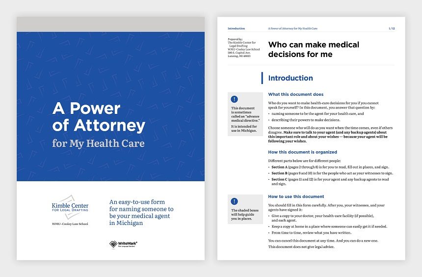
Organising a power of attorney document for your healthcare means others can take care of you when you can’t. Image by Bimatshu Pyakuryal / Unsplash licence
We all hope we’ll always be able to make our own decisions about our healthcare. But what if we can’t?
The Kimble Center for Legal Drafting, based at Western Michigan University–Cooley Law School in the US, has published a new Power of Attorney document. People can use the Power of Attorney to set up someone they trust to make decisions about their healthcare if they’re not able to. What’s more, the Power of Attorney is easy to understand — and it’s free to use for US citizens.
Design elements guide the user through the document. Image by Gusto Design.
The Kimble Center’s legal team decided they wanted their new document to be top of its class. So they first asked the members of their advisory board for feedback. Then they applied for another layer of review through the WriteMark assessment process.
The WriteMark® assessment considers purpose, structure, content, language, and design as part of a rigorous document analysis.
Design to support the purpose of the document
The Center engaged the team at Gusto Design to create a design that would support clarity and readability.
Annette Ellis, Creative Director at Gusto, explains:
We worked with the Kimble Center for Legal Drafting to make a complex process clear and easy to understand. The plain language used for the Power of Attorney form is visually supported using design elements that guide the user through the form, making it easy for them to understand and fill out.
Instructions are provided as shaded boxes adjacent to the form fields, providing users with additional information that helps them understand how to fill out the form correctly. This extra guidance is critical to ensure the form accurately captures their wishes.
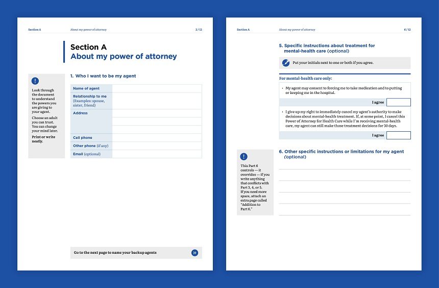
Clear design is critical to ensure the form accurately captures the user’s wishes. Image by Gusto Design
All boxes ticked
With its plain language and simple design, the Power of Attorney for My Health Care goes to the top of its class. It meets all the elements of the WriteMark® Plain Language Standard — and it’s the first document of its type to achieve the Standard.
Joseph Kimble, Distinguished Professor Emeritus at WMU–Cooley Law School, acknowledges the input from the WriteMark® team:
I’m grateful for the invaluable suggestions we received from Anne-Marie Chisnall (a member of our international board of advisers) and then from the WriteMark® assessment team. Those suggestions significantly improved almost every page.
And tested with users too
Since we originally published this story, researchers at Michigan State University have user-tested the Power of Attorney document. The Kimble Center applied recommendations from the user-testing report and did a little rewording and redesigning of the document. With these changes, the Power of Attorney achieved WriteMark® Plus.
WriteMark® Plus is awarded to documents that have reached the WriteMark® Standard and that also undergo user-testing for further fine-tuning.
Find out more about WriteMark® Plus — the ultimate in communication excellence
Legal documents unlike anything that the public has seen before
The Kimble Center for Legal Drafting paves the way for innovative legal documents. This article on the Center’s website describes its origins and goals.
Anne-Marie Chisnall July 31st, 2020
Posted In: The WriteMark, WriteMark Holders, WriteMark Plus
Tags: accessibility, Joseph Kimble, Kimble Center for Legal Drafting, Legal documents, plain language, the WriteMark, WriteMark Plus
Clarity is the heart of the matter

Long roads can read to beautiful destinations.
Australia’s Budget Direct Insurance is always looking for ways to set itself apart from the competition. In 2017 the company identified the opportunity to improve the overall customer experience, by creating the easiest-to-understand Home and Contents Product Disclosure Statement (PDS) in the marketplace.
After a highly worthwhile journey — that took a little longer than expected — the new PDS was published this week. And it became the world’s first document carrying the heart with a tick — not just the prestigious WriteMark®, but the ultimate WriteMark® Plus.
What is the WriteMark® Plus?
When a document or website holds the WriteMark®, customers know that the writing meets a very high standard of clarity. Experts have evaluated the writing against rigorous criteria, emphasising the needs of the audience. The WriteMark® Plus includes testing the document with the intended audience.
Each journey begins with a single step
By mid-2018, Budget Direct had spent 12 months gathering information about the challenge ahead:
- analysing PDSs available to consumers
- running workshops with the business
- analysing their current document
- considering potential regulatory reforms.
Struggling to find good examples to follow, they extended their search. They saw that Tower in New Zealand had won an award in the Plain Language Awards. They phoned us to ask who did our type of work in Australia. ‘We do,’ we told them. Two of our consultants travelled to Brisbane to talk about Budget Direct’s vision for the document and how we could help.
The road is long, and good things take time
The project involved a lot more than a simple rewrite. For the change to be permanent, Write and the project team at Budget Direct needed to bring the rest of the organisation along with them.
Legal and compliance teams had to be satisfied that the changes reduced risk rather than introducing it. Systems and processes had to change with the new content. Every piece of content needed to be tracked through each stage of writing, review, editing, and testing.
Fortunately, Budget Direct took the time they needed to deliver the best result.
Difficult roads often lead to beautiful destinations
After lots of hard work, the Budget Direct PDS for the Home and Contents Policy is at last ready to take its place in the market. It’s now easy to read, understand, and act on. Insurance customers have endorsed the change. And the policy carries the WriteMark® Plus to confirm all that care has paid off.
Budget Direct told us at the start of the project that success is when customers say, ‘Wow! I didn’t know insurance could be this easy.’
‘Write made it easy. Customers now have a quality PDS that’s easy to read and understand. Our consultants love it because they can now have more informative conversations and deliver greater value to our customers.’
That was Write’s goal. That’s why we’re proud to have given Budget Direct a document with heart.
Check out Gusto, the wonderful designers who worked on the document.
Explore the design in Gusto’s portfolio of recent work
And you can view the whole document at the WriteMark® holders page.
Anne-Marie Chisnall September 13th, 2019
Posted In: WriteMark Plus
Tags: Budget Direct, clear language, clear thinking, clear writing, improved writing, industry standards, plain language, power of plain language, Quality writing, writing for the public