WriteMark
Plain Language Standard
Understanding the WriteMark® design guidelines

Follow the WriteMark design guidelines to create clear, welcoming documents that your readers will love. Image by Sarah Pflug / Shopify licence
One of the criteria we use to evaluate documents is actually a bundle of requirements in one question: ‘Does the document meet the WriteMark® design guidelines?’
What are the design guidelines? Why are they important? And how can a document meet them? Today’s blog walks you through the design guidelines and explains why they’re part of the WriteMark® Plain Language Standard. Click the link below to see the design guidelines for yourself.
Download the WriteMark® design guidelines
The design guidelines ensure a document looks clean, clear, and accessible
The WriteMark® design guidelines cover four main areas, which we’ll explore in detail below.
- Text and headings
- Spacing and margins
- Graphics and colour
- Navigation
The guidelines ensure documents are inviting and easily legible. They favour simplicity over complexity, and support a clean, open, and accessible reading experience (without compromising brand look and feel).
Like the text and ‘big picture’ elements of the WriteMark®, the design guidelines prioritise the reader. They create a reading experience that aids navigation and understanding. Most importantly, they make documents work for the widest possible audience, by ensuring vision-impaired readers can access and use them.
However, the WriteMark® design guidelines are not a comprehensive resource for creating accessible documents.
Check out our blog posts on accessibility for more tips
Text and headings — ensure fonts are legible and headings aid navigation
The text elements of the WriteMark® design guidelines are mostly satisfied by choosing an easy-to-read typeface and a clearly legible font size. ‘Easy-to-read’ is slightly subjective, but as long as it’s not too light, narrow, or heavy — and you minimise bold, italics, and capitals — it should meet the standard.
The actual size of text, and how easy it is to read, depends on the typeface you choose. We usually recommend a 10-point minimum font size, but some typefaces may need to be bigger or smaller.
Headings help readers skim-read to find the information they need. To do this, they need to be formatted in a clear hierarchy (for example, top-level headings are the biggest, then second-level headings, and so on). Font size, weight, and colour can all work to distinguish different heading levels. Italics and underlining can work too, if needed.
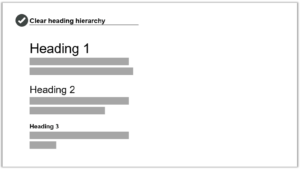
Use a clear heading hierarchy to show the relationship between different sections and subsections in text. Image by Write Limited
The spacing above and below headings should put them closer to the paragraph they introduce, rather than ‘floating’ equally between the text before and after.
Finally, avoid ALL-CAPS and Title Case in headings — sentence case is easier on the eyes.
Spacing and margins — use white space to create an inviting layout
As readers, our eyes are drawn towards a roomy layout with plenty of white space (meaning parts of the page with nothing on them). On the other hand, a dense ‘wall of text’ looks and feels like a struggle to read. These can drive readers away.
To achieve a spacious layout:
- use generous margins and spacing to create white space around your text
- use ample and consistent spacing between lines and paragraphs.
A 2.5cm or more margin is good for printed documents. Microsoft Word uses 2.54cm margins (or 1 inch) by default.
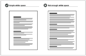
Wide margins and generous spacing create ample white space. A page without enough white space looks cluttered and feels like a chore to read. Image by Write Limited
Comfy margins, spacing, and font size should also create a readable line length. Line length is the number of words or characters on each line of text. We recommend aiming for 45–75 characters per line for printed text. Longer line length can look and feel like a chore to read.
Use spacing to show the relationship between different elements on the page
You can also use spacing to support navigation. Readers automatically recognise a kind of ‘layout language’ created by grouping and aligning certain elements. Use spacing to reinforce elements that are connected, and create breaks between elements you want to separate.
More specifically, our design guidelines recommend you:
- use line spacing to visually group bullet lists with the text that introduces them
- align images with margins, and place them close to relevant text and explanations.
Graphics and colour — choose images that support text and use contrasting colours
If your document includes graphics, make sure they clearly support or clarify the text. Graphics that are only tangentially related to the text can throw readers off-course. Check that graphics have the necessary captions, titles, or labels as appropriate.
Graphics need to be easily legible without zooming or squinting. Consider the different ways readers will encounter your graphics (for example, printed or online), and make sure they are large and clear enough across all of the options.
To accommodate visually impaired readers, make sure graphics have either:
- alt text — short descriptions for simple photos and illustrations
- long descriptions — detailed explanations of complex elements, like graphs.
Check that the colours you use have a strong enough contrast to be easily legible. If colours are too similar, some elements become difficult to read — especially for colour-blind readers. Use a tool like Colour Contrast Analyser to check your colours, and be aware that smaller fonts need higher contrast.
Download Colour Contrast Analyser
Navigation — create well-defined sections and include a table of contents
Finally, use design to help readers navigate through your document.
We’ve mentioned already how heading hierarchy and spacing can help readers understand the relationship between sections and subsections in a document. Here are some more tips to improve navigation.
- Make each new section obvious (consider a page break if space allows).
- Include a table of contents for documents longer than two or three pages.
- Make sure the table of contents has ‘leader lines’ between the section heading and page number.
- Check that all links in digital documents work, including in the table of contents.
Trust your gut
Our final tip is not written in the design guidelines: trust your gut!
Implementing great design takes skill and experience. But recognising good design is something anyone can do.
Put yourself in your reader’s shoes. Take a step back and look at your document — does anything look unbalanced, or busy? Is your eye drawn where it needs to go? Does the density of text feel light and digestible, or does just looking at it make you want to close the window and take a coffee break?
Your own reaction is instructive, because it may indicate how other readers will respond to your document’s layout.
Follow the design guidelines — and trust your gut!
Download the WriteMark® design guidelines
Ryan Tippet July 9th, 2024
Posted In: The WriteMark
Tags: accessibility, clear communication, clear thinking, clear writing, design, design guidelines, guidelines, plain language, Quality writing, the WriteMark, WriteMark