WriteMark
Plain Language Standard
Understanding the WriteMark® design guidelines

Follow the WriteMark design guidelines to create clear, welcoming documents that your readers will love. Image by Sarah Pflug / Shopify licence
One of the criteria we use to evaluate documents is actually a bundle of requirements in one question: ‘Does the document meet the WriteMark® design guidelines?’
What are the design guidelines? Why are they important? And how can a document meet them? Today’s blog walks you through the design guidelines and explains why they’re part of the WriteMark® Plain Language Standard. Click the link below to see the design guidelines for yourself.
Download the WriteMark® design guidelines
The design guidelines ensure a document looks clean, clear, and accessible
The WriteMark® design guidelines cover four main areas, which we’ll explore in detail below.
- Text and headings
- Spacing and margins
- Graphics and colour
- Navigation
The guidelines ensure documents are inviting and easily legible. They favour simplicity over complexity, and support a clean, open, and accessible reading experience (without compromising brand look and feel).
Like the text and ‘big picture’ elements of the WriteMark®, the design guidelines prioritise the reader. They create a reading experience that aids navigation and understanding. Most importantly, they make documents work for the widest possible audience, by ensuring vision-impaired readers can access and use them.
However, the WriteMark® design guidelines are not a comprehensive resource for creating accessible documents.
Check out our blog posts on accessibility for more tips
Text and headings — ensure fonts are legible and headings aid navigation
The text elements of the WriteMark® design guidelines are mostly satisfied by choosing an easy-to-read typeface and a clearly legible font size. ‘Easy-to-read’ is slightly subjective, but as long as it’s not too light, narrow, or heavy — and you minimise bold, italics, and capitals — it should meet the standard.
The actual size of text, and how easy it is to read, depends on the typeface you choose. We usually recommend a 10-point minimum font size, but some typefaces may need to be bigger or smaller.
Headings help readers skim-read to find the information they need. To do this, they need to be formatted in a clear hierarchy (for example, top-level headings are the biggest, then second-level headings, and so on). Font size, weight, and colour can all work to distinguish different heading levels. Italics and underlining can work too, if needed.
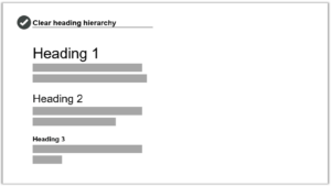
Use a clear heading hierarchy to show the relationship between different sections and subsections in text. Image by Write Limited
The spacing above and below headings should put them closer to the paragraph they introduce, rather than ‘floating’ equally between the text before and after.
Finally, avoid ALL-CAPS and Title Case in headings — sentence case is easier on the eyes.
Spacing and margins — use white space to create an inviting layout
As readers, our eyes are drawn towards a roomy layout with plenty of white space (meaning parts of the page with nothing on them). On the other hand, a dense ‘wall of text’ looks and feels like a struggle to read. These can drive readers away.
To achieve a spacious layout:
- use generous margins and spacing to create white space around your text
- use ample and consistent spacing between lines and paragraphs.
A 2.5cm or more margin is good for printed documents. Microsoft Word uses 2.54cm margins (or 1 inch) by default.
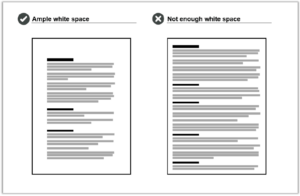
Wide margins and generous spacing create ample white space. A page without enough white space looks cluttered and feels like a chore to read. Image by Write Limited
Comfy margins, spacing, and font size should also create a readable line length. Line length is the number of words or characters on each line of text. We recommend aiming for 45–75 characters per line for printed text. Longer line length can look and feel like a chore to read.
Use spacing to show the relationship between different elements on the page
You can also use spacing to support navigation. Readers automatically recognise a kind of ‘layout language’ created by grouping and aligning certain elements. Use spacing to reinforce elements that are connected, and create breaks between elements you want to separate.
More specifically, our design guidelines recommend you:
- use line spacing to visually group bullet lists with the text that introduces them
- align images with margins, and place them close to relevant text and explanations.
Graphics and colour — choose images that support text and use contrasting colours
If your document includes graphics, make sure they clearly support or clarify the text. Graphics that are only tangentially related to the text can throw readers off-course. Check that graphics have the necessary captions, titles, or labels as appropriate.
Graphics need to be easily legible without zooming or squinting. Consider the different ways readers will encounter your graphics (for example, printed or online), and make sure they are large and clear enough across all of the options.
To accommodate visually impaired readers, make sure graphics have either:
- alt text — short descriptions for simple photos and illustrations
- long descriptions — detailed explanations of complex elements, like graphs.
Check that the colours you use have a strong enough contrast to be easily legible. If colours are too similar, some elements become difficult to read — especially for colour-blind readers. Use a tool like Colour Contrast Analyser to check your colours, and be aware that smaller fonts need higher contrast.
Download Colour Contrast Analyser
Navigation — create well-defined sections and include a table of contents
Finally, use design to help readers navigate through your document.
We’ve mentioned already how heading hierarchy and spacing can help readers understand the relationship between sections and subsections in a document. Here are some more tips to improve navigation.
- Make each new section obvious (consider a page break if space allows).
- Include a table of contents for documents longer than two or three pages.
- Make sure the table of contents has ‘leader lines’ between the section heading and page number.
- Check that all links in digital documents work, including in the table of contents.
Trust your gut
Our final tip is not written in the design guidelines: trust your gut!
Implementing great design takes skill and experience. But recognising good design is something anyone can do.
Put yourself in your reader’s shoes. Take a step back and look at your document — does anything look unbalanced, or busy? Is your eye drawn where it needs to go? Does the density of text feel light and digestible, or does just looking at it make you want to close the window and take a coffee break?
Your own reaction is instructive, because it may indicate how other readers will respond to your document’s layout.
Follow the design guidelines — and trust your gut!
Download the WriteMark® design guidelines
Ryan Tippet July 9th, 2024
Posted In: The WriteMark
Tags: accessibility, clear communication, clear thinking, clear writing, design, design guidelines, guidelines, plain language, Quality writing, the WriteMark, WriteMark
Clear legal documents give clear legal authority

Naming a power of attorney means someone else can make decisions for you if you can’t | Photo by Romain Dancre on Unsplash
We all hope we’ll always be able to make our own decisions about our finances and property. But what if we can’t?
Anyone can lose the ability to deal with their affairs through accident or illness. If nobody has the legal authority to act for you or sign documents, dealing with your affairs can be difficult and stressful for you and your family.
A durable power of attorney allows you to give someone the legal power to deal with your affairs and make decisions for you. Setting up a power of attorney means that you control who manages your affairs.
Building a library of free-to-use legal resources
The Kimble Center for Legal Drafting, based at Western Michigan University–Cooley Law School in the US, specialises in writing easy-to-understand legal documents. Their mission is to produce clear legal documents that are free for the public to use in Michigan.
The Kimble Center has published a new Power of Attorney document. People can use it to name someone they trust to make decisions about their finances if they’re not able to.
Reaching the high standard of the WriteMark® Plus
The new Power of Attorney follows the pattern of the earlier Power of Attorney for My Health Care. And it has been assessed as meeting the WriteMark® criteria for purpose, structure, content, language, and design.
Eventually the Power of Attorney for My Finances also achieved the WriteMark® Plus Plain Language Standard. The WriteMark® Plus combines an elements-based assessment with user-testing. The results of user-testing led to further fine-tuning of the content.
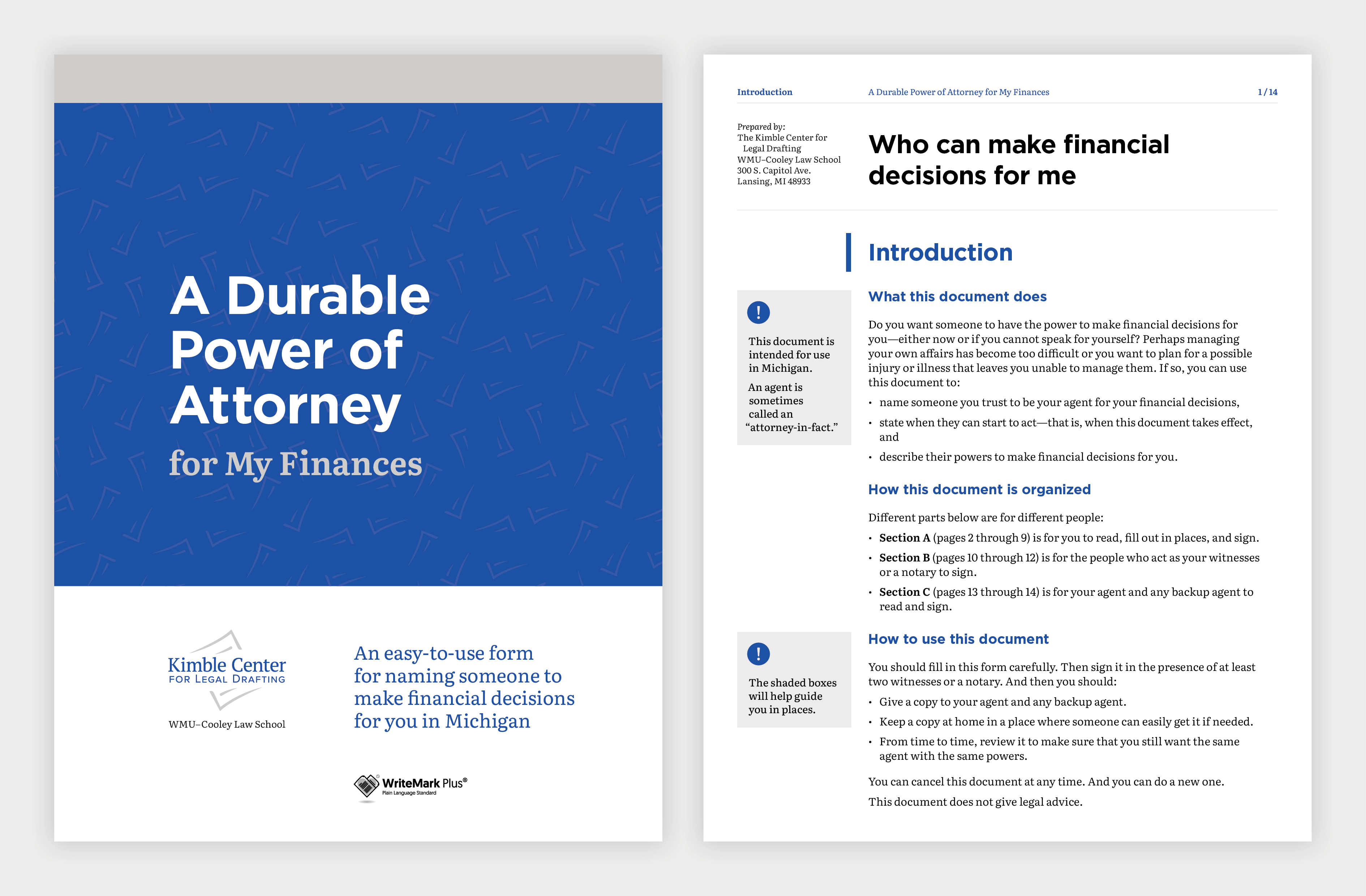
Design elements guide the user through the document | Image by Gusto Design
Using careful design to support the purpose of the document
The Kimble Center engaged the team at Gusto Design to create a design that would support clarity and accessibility.
Annette Ellis, Creative Director at Gusto, explains:
Once again, we worked with the Kimble Center for Legal Drafting to make a complex process clear and easy to understand. The plain language used in the Power of Attorney form is visually supported using design elements that guide the user through the form, making it easy for users to understand and fill out the required information.
Instructions are provided as shaded boxes adjacent to the form fields, providing users with additional information that helps them understand how to fill out the form correctly. This extra guidance is critical to ensure the form accurately captures their wishes.
The form is screen-readable, and it has fillable fields that make it extra easy to use.
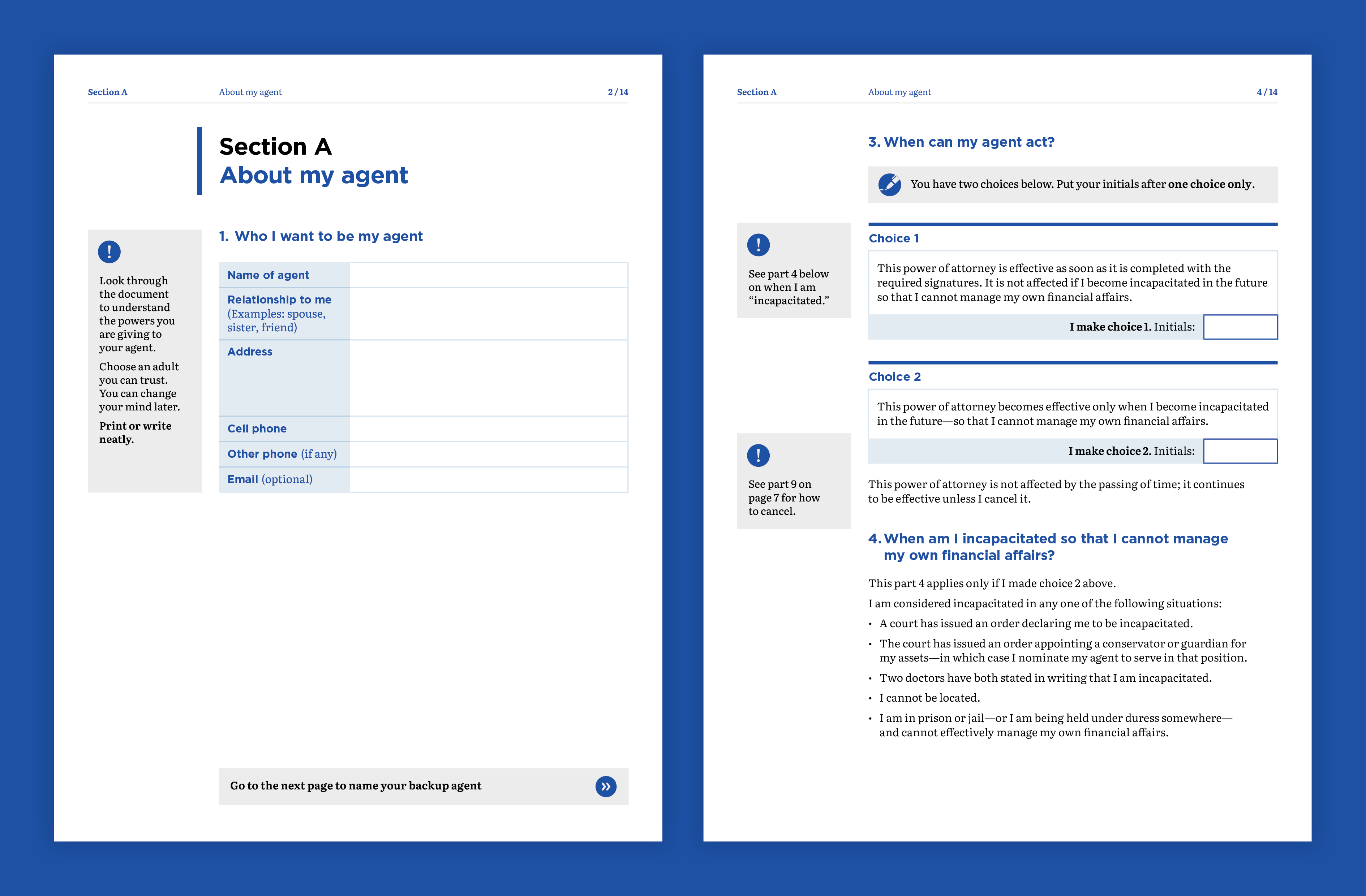
Clear design is critical to ensure the form accurately captures the user’s wishes | Image by Gusto Design
Creating legal documents with a difference
With its plain language and simple design, the Power of Attorney for My Finances joins its health-care companion as a legal document unlike most others.
Joseph Kimble, Distinguished Professor Emeritus at WMU–Cooley Law School, explains:
These two powers of attorney — one for medical decisions and the other for financial decisions — are unlike any legal document you are used to seeing. Both have been tested with users, and both of them are about as user-friendly as they can be.
The lesson? Legal documents do not have to be impenetrable to ordinary readers.
‘Clear and easy to read’
Achieving the WriteMark® Plus gives the Kimble Center and users of their document library extra assurance that the document is as clear as it can be.
In this case, user-testing participants had lots of praise for the document. Here are a few of their comments:
It’s clear and it’s easy to read.
The layout and design of the document is clear and easy to read. It’s a five out of five. Lovely!
This certainly is concise, clear layman terms to tell them what the intended use is and then how to use it.
How easily explained each section of it is … I think it was really, really well designed and very self-explanatory. And just really nicely laid out and easily understandable.
Joseph Kimble enjoyed working with the teams at Write and Gusto.
This is the second project on which the Kimble Center for Legal Drafting has teamed with Write and Gusto. Both are a joy to work with. They deliver on time, and their editing and design work is superb.
Find out more about WriteMark® Plus — the ultimate in communication excellence
The Kimble Center for Legal Drafting paves the way for innovative legal documents. This article on the Center’s website describes its origins and goals.
Anne-Marie Chisnall November 29th, 2022
Posted In: WriteMark Holders, WriteMark Plus
Tags: accessibility, clear language, form, Joseph Kimble, Kimble Center for Legal Drafting, Legal documents, WriteMark Plus
Start as you mean to go on — with clarity

Verity White of Checklist Legal believes plain language builds trust in client relationships | Photo courtesy of Checklist Legal
For a small-to-medium business, working with people who have similar values and goals is really important. Building a lasting and valuable client relationship relies on trust, and from the client’s perspective, that relationship starts at the point of engagement. So Verity White of Checklist Legal decided she wanted really clear documents to start off the client relationship.
She drafted the documents herself but decided to get some external help from Write and WriteMark®. That way she could be doubly sure the client would know what they were signing up to and the relationship would start off on the right foot.
Checklist Legal makes legal advice clear
Verity’s company is all about taking the stress and confusion away from legal situations. One of the main ways she achieves that is through her clear, easy-to-understand advice. She creates readable documents that help her clients achieve their business goals.
Contracts are a core part of a business and reflect the way a business builds a client relationship. Verity is passionate about the ways that clear contracts support client connection and engagement, representing an authentic brand voice, so that the contracts feel like something that belongs to the business. That’s why achieving the WriteMark felt so important to Verity and Checklist Legal.
Verity tells her story below.
Using the ‘Rewrite’ principles to achieve clarity and develop trust
I first came across Write when I attended the plain language conference in Wellington, New Zealand in 2016. I absolutely fell in love with Write as a plain language organisation and with their Rewrite for Change programme. I knew I wanted to be involved with them in some way, shape, or form! And it took launching my own boutique law firm to make that opportunity come about.

Verity White of Checklist Legal was inspired by plain language principles to apply them to her own business | Photo courtesy of Checklist Legal
I thought my engagement documents were pretty good. I had met a bunch of the readability criteria that I had set for myself in creating them, as well worked on the information design. And then I got some really helpful feedback from the Write team, and they helped me refine things a little bit further.
Getting an independent peer review
Camilla Anderson, one of my other plain language and visual contracting heroes. always says that if you had two people speaking French and you wanted to simplify French into a different language, you wouldn’t get French people who only speak French to simplify that language.
So when it comes to simplifying legal writing, having someone else take a look at your own legal writing is often a great approach. It gives you a fresh eye, and it is that trained professional view that I really appreciated from having Write go through the documents. Of course, the ultimate decision on the legal bits and pieces of the documents sits with me. But I really appreciated the advice and patience of the Write team, as we worked through the finer points of the wording together.
Walking the talk by achieving the WriteMark® and other certification
I wanted to be able to show that I was walking the walk and talking the talk when it comes to plain language, which I think is really important for law firms. A lot of law firms claim to be writing in plain language, but they really don’t go to the effort of getting their documents checked out fully. And I think that’s shown by the fact that Checklist Legal is the first law firm in Australia to have certified its plain language engagement documents with Write.
In very exciting news, Checklist Legal has recently become a certified B Corp! And I’ve published my new book called Create Contracts Clients Love — the title says it all really!
Check out Verity’s book called Create Contracts Clients Love
Find out about Checklist Legal’s B Corp impact
Find out about Checklist Legal’s pro bono programme
Anne-Marie Chisnall June 9th, 2022
Posted In: WriteMark Holders
Tags: accessibility, Australia, Checklist Legal, client engagement, client relationship, consultancy, law firm, legal agreement, Legal documents, legal writing, plain language, the WriteMark, trust
Kimble Center’s healthcare form awarded ClearMark

The Kimble Center's Power of Attorney for healthcare goes to new heights | Photo by Brands&People on Unsplash
Could the Kimble Center for Legal Drafting’s Power of Attorney for healthcare win any more accolades? Turns out the answer is a definite ‘yes’.
The ClearMark Awards judged the healthcare form worthy of the award for best legal document. The ClearMarks are organised by the US Center for Plain Language and recognise the best plain language communications created by organisations in North America. The Center’s Barbra Kingsley and Alex Miranda announced the 2021 winners as part of the Access for All virtual conference in May.
The judges said about the power of attorney that:
[it] is a wonderful example of making legal text accessible.
And they went on to say:
The writers conducted several different kinds of user testing, including with health professionals and typical lay users. They also benefited from input from the Center’s international board members and PL (plain language) experts in New Zealand. The effort shines through. It’s an exemplary piece, worthy of being winner in its category.
View the list of ClearMark winners
Read about the ClearMark award in an article by Oakland County Legal News
Taking legal documents to new heights
The Kimble Center for Legal Drafting paves the way for innovative, accessible legal documents. This article on the Center’s website describes its origins and goals.
People can use the Power of Attorney document to set up a person they trust to make decisions about their healthcare if they’re not able to. The Power of Attorney is easy to understand and fill out — and it’s free to use for US citizens.
More than 1000 people have used the form since it was published.
Find out more about WriteMark® Plus — the ultimate in communication excellence
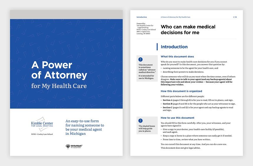
Design elements guide the user through the document. Image by Gusto Design.
Anne-Marie Chisnall May 21st, 2021
Posted In: The WriteMark, WriteMark Holders, WriteMark Plus
Tags: accessibility, ClearMark, Joseph Kimble, Kimble Center for Legal Drafting, Legal documents, plain language, WriteMark, WriteMark Plus
Kimble Center’s Power of Attorney goes to the top of its class

Organising a power of attorney document for your healthcare means others can take care of you when you can’t. Image by Bimatshu Pyakuryal / Unsplash licence
We all hope we’ll always be able to make our own decisions about our healthcare. But what if we can’t?
The Kimble Center for Legal Drafting, based at Western Michigan University–Cooley Law School in the US, has published a new Power of Attorney document. People can use the Power of Attorney to set up someone they trust to make decisions about their healthcare if they’re not able to. What’s more, the Power of Attorney is easy to understand — and it’s free to use for US citizens.

Design elements guide the user through the document. Image by Gusto Design.
The Kimble Center’s legal team decided they wanted their new document to be top of its class. So they first asked the members of their advisory board for feedback. Then they applied for another layer of review through the WriteMark assessment process.
The WriteMark® assessment considers purpose, structure, content, language, and design as part of a rigorous document analysis.
Design to support the purpose of the document
The Center engaged the team at Gusto Design to create a design that would support clarity and readability.
Annette Ellis, Creative Director at Gusto, explains:
We worked with the Kimble Center for Legal Drafting to make a complex process clear and easy to understand. The plain language used for the Power of Attorney form is visually supported using design elements that guide the user through the form, making it easy for them to understand and fill out.
Instructions are provided as shaded boxes adjacent to the form fields, providing users with additional information that helps them understand how to fill out the form correctly. This extra guidance is critical to ensure the form accurately captures their wishes.
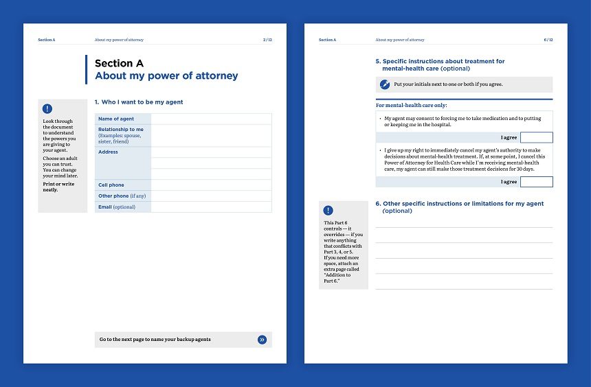
Clear design is critical to ensure the form accurately captures the user’s wishes. Image by Gusto Design
All boxes ticked
With its plain language and simple design, the Power of Attorney for My Health Care goes to the top of its class. It meets all the elements of the WriteMark® Plain Language Standard — and it’s the first document of its type to achieve the Standard.
Joseph Kimble, Distinguished Professor Emeritus at WMU–Cooley Law School, acknowledges the input from the WriteMark® team:
I’m grateful for the invaluable suggestions we received from Anne-Marie Chisnall (a member of our international board of advisers) and then from the WriteMark® assessment team. Those suggestions significantly improved almost every page.
And tested with users too
Since we originally published this story, researchers at Michigan State University have user-tested the Power of Attorney document. The Kimble Center applied recommendations from the user-testing report and did a little rewording and redesigning of the document. With these changes, the Power of Attorney achieved WriteMark® Plus.
WriteMark® Plus is awarded to documents that have reached the WriteMark® Standard and that also undergo user-testing for further fine-tuning.
Find out more about WriteMark® Plus — the ultimate in communication excellence
Legal documents unlike anything that the public has seen before
The Kimble Center for Legal Drafting paves the way for innovative legal documents. This article on the Center’s website describes its origins and goals.
Anne-Marie Chisnall July 31st, 2020
Posted In: The WriteMark, WriteMark Holders, WriteMark Plus
Tags: accessibility, Joseph Kimble, Kimble Center for Legal Drafting, Legal documents, plain language, the WriteMark, WriteMark Plus