WriteMark
Plain Language Standard
Clear legal documents give clear legal authority

Naming a power of attorney means someone else can make decisions for you if you can’t | Photo by Romain Dancre on Unsplash
We all hope we’ll always be able to make our own decisions about our finances and property. But what if we can’t?
Anyone can lose the ability to deal with their affairs through accident or illness. If nobody has the legal authority to act for you or sign documents, dealing with your affairs can be difficult and stressful for you and your family.
A durable power of attorney allows you to give someone the legal power to deal with your affairs and make decisions for you. Setting up a power of attorney means that you control who manages your affairs.
Building a library of free-to-use legal resources
The Kimble Center for Legal Drafting, based at Western Michigan University–Cooley Law School in the US, specialises in writing easy-to-understand legal documents. Their mission is to produce clear legal documents that are free for the public to use in Michigan.
The Kimble Center has published a new Power of Attorney document. People can use it to name someone they trust to make decisions about their finances if they’re not able to.
Reaching the high standard of the WriteMark® Plus
The new Power of Attorney follows the pattern of the earlier Power of Attorney for My Health Care. And it has been assessed as meeting the WriteMark® criteria for purpose, structure, content, language, and design.
Eventually the Power of Attorney for My Finances also achieved the WriteMark® Plus Plain Language Standard. The WriteMark® Plus combines an elements-based assessment with user-testing. The results of user-testing led to further fine-tuning of the content.
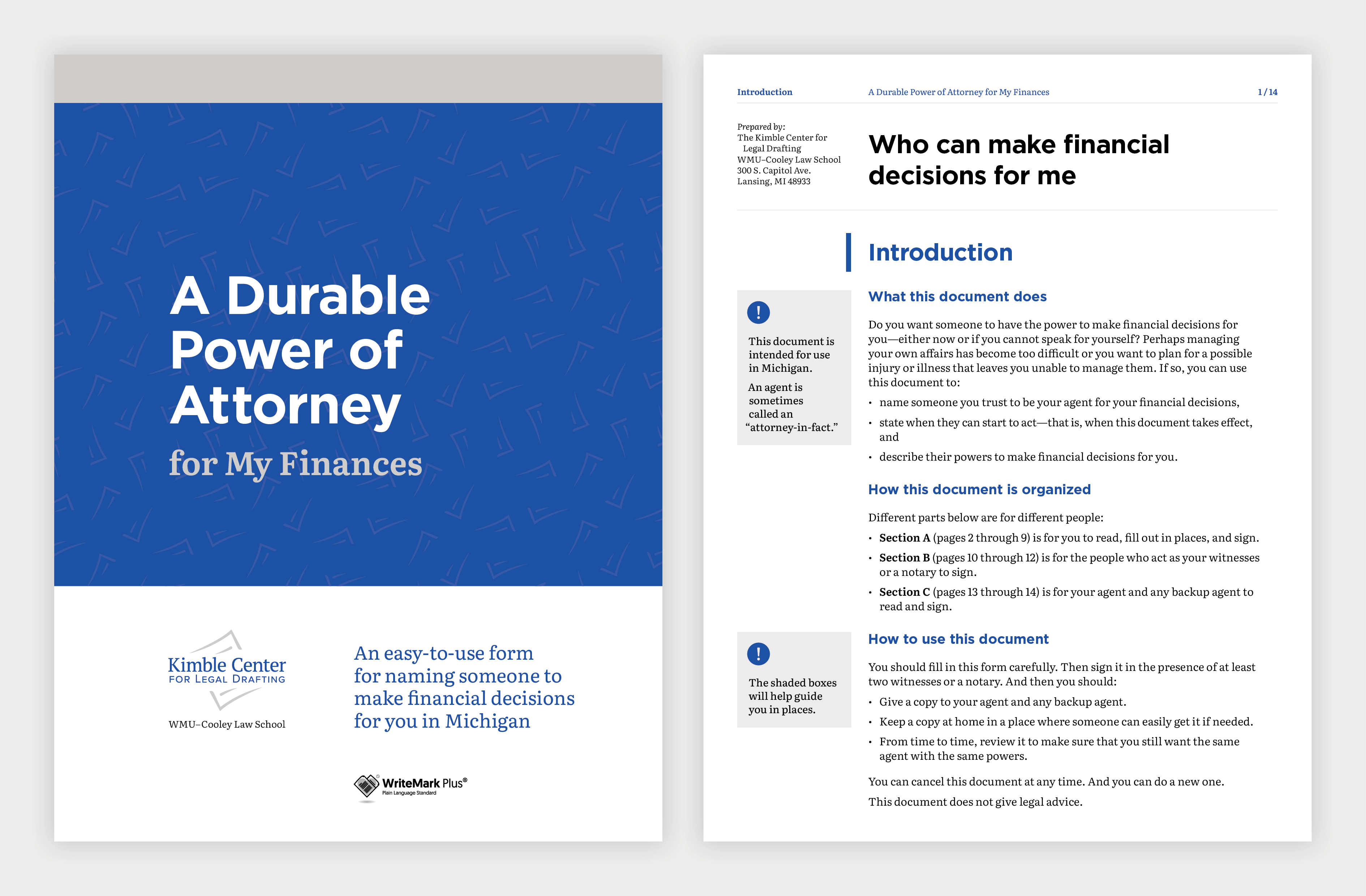
Design elements guide the user through the document | Image by Gusto Design
Using careful design to support the purpose of the document
The Kimble Center engaged the team at Gusto Design to create a design that would support clarity and accessibility.
Annette Ellis, Creative Director at Gusto, explains:
Once again, we worked with the Kimble Center for Legal Drafting to make a complex process clear and easy to understand. The plain language used in the Power of Attorney form is visually supported using design elements that guide the user through the form, making it easy for users to understand and fill out the required information.
Instructions are provided as shaded boxes adjacent to the form fields, providing users with additional information that helps them understand how to fill out the form correctly. This extra guidance is critical to ensure the form accurately captures their wishes.
The form is screen-readable, and it has fillable fields that make it extra easy to use.
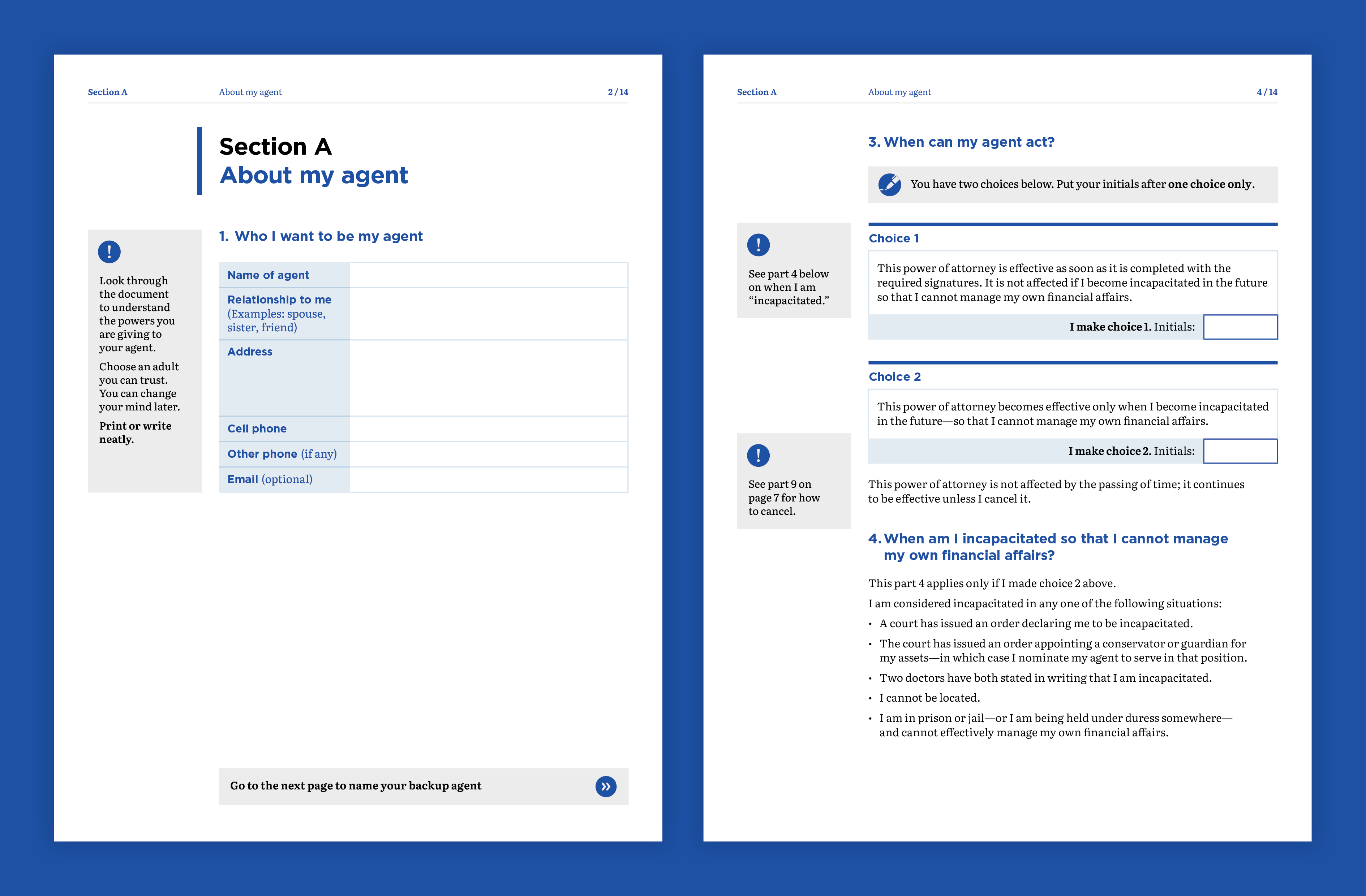
Clear design is critical to ensure the form accurately captures the user’s wishes | Image by Gusto Design
Creating legal documents with a difference
With its plain language and simple design, the Power of Attorney for My Finances joins its health-care companion as a legal document unlike most others.
Joseph Kimble, Distinguished Professor Emeritus at WMU–Cooley Law School, explains:
These two powers of attorney — one for medical decisions and the other for financial decisions — are unlike any legal document you are used to seeing. Both have been tested with users, and both of them are about as user-friendly as they can be.
The lesson? Legal documents do not have to be impenetrable to ordinary readers.
‘Clear and easy to read’
Achieving the WriteMark® Plus gives the Kimble Center and users of their document library extra assurance that the document is as clear as it can be.
In this case, user-testing participants had lots of praise for the document. Here are a few of their comments:
It’s clear and it’s easy to read.
The layout and design of the document is clear and easy to read. It’s a five out of five. Lovely!
This certainly is concise, clear layman terms to tell them what the intended use is and then how to use it.
How easily explained each section of it is … I think it was really, really well designed and very self-explanatory. And just really nicely laid out and easily understandable.
Joseph Kimble enjoyed working with the teams at Write and Gusto.
This is the second project on which the Kimble Center for Legal Drafting has teamed with Write and Gusto. Both are a joy to work with. They deliver on time, and their editing and design work is superb.
Find out more about WriteMark® Plus — the ultimate in communication excellence
The Kimble Center for Legal Drafting paves the way for innovative legal documents. This article on the Center’s website describes its origins and goals.
Anne-Marie Chisnall November 29th, 2022
Posted In: WriteMark Holders, WriteMark Plus
Tags: accessibility, clear language, form, Joseph Kimble, Kimble Center for Legal Drafting, Legal documents, WriteMark Plus
Start as you mean to go on — with clarity

Verity White of Checklist Legal believes plain language builds trust in client relationships | Photo courtesy of Checklist Legal
For a small-to-medium business, working with people who have similar values and goals is really important. Building a lasting and valuable client relationship relies on trust, and from the client’s perspective, that relationship starts at the point of engagement. So Verity White of Checklist Legal decided she wanted really clear documents to start off the client relationship.
She drafted the documents herself but decided to get some external help from Write and WriteMark®. That way she could be doubly sure the client would know what they were signing up to and the relationship would start off on the right foot.
Checklist Legal makes legal advice clear
Verity’s company is all about taking the stress and confusion away from legal situations. One of the main ways she achieves that is through her clear, easy-to-understand advice. She creates readable documents that help her clients achieve their business goals.
Contracts are a core part of a business and reflect the way a business builds a client relationship. Verity is passionate about the ways that clear contracts support client connection and engagement, representing an authentic brand voice, so that the contracts feel like something that belongs to the business. That’s why achieving the WriteMark felt so important to Verity and Checklist Legal.
Verity tells her story below.
Using the ‘Rewrite’ principles to achieve clarity and develop trust
I first came across Write when I attended the plain language conference in Wellington, New Zealand in 2016. I absolutely fell in love with Write as a plain language organisation and with their Rewrite for Change programme. I knew I wanted to be involved with them in some way, shape, or form! And it took launching my own boutique law firm to make that opportunity come about.

Verity White of Checklist Legal was inspired by plain language principles to apply them to her own business | Photo courtesy of Checklist Legal
I thought my engagement documents were pretty good. I had met a bunch of the readability criteria that I had set for myself in creating them, as well worked on the information design. And then I got some really helpful feedback from the Write team, and they helped me refine things a little bit further.
Getting an independent peer review
Camilla Anderson, one of my other plain language and visual contracting heroes. always says that if you had two people speaking French and you wanted to simplify French into a different language, you wouldn’t get French people who only speak French to simplify that language.
So when it comes to simplifying legal writing, having someone else take a look at your own legal writing is often a great approach. It gives you a fresh eye, and it is that trained professional view that I really appreciated from having Write go through the documents. Of course, the ultimate decision on the legal bits and pieces of the documents sits with me. But I really appreciated the advice and patience of the Write team, as we worked through the finer points of the wording together.
Walking the talk by achieving the WriteMark® and other certification
I wanted to be able to show that I was walking the walk and talking the talk when it comes to plain language, which I think is really important for law firms. A lot of law firms claim to be writing in plain language, but they really don’t go to the effort of getting their documents checked out fully. And I think that’s shown by the fact that Checklist Legal is the first law firm in Australia to have certified its plain language engagement documents with Write.
In very exciting news, Checklist Legal has recently become a certified B Corp! And I’ve published my new book called Create Contracts Clients Love — the title says it all really!
Check out Verity’s book called Create Contracts Clients Love
Find out about Checklist Legal’s B Corp impact
Find out about Checklist Legal’s pro bono programme
Anne-Marie Chisnall June 9th, 2022
Posted In: WriteMark Holders
Tags: accessibility, Australia, Checklist Legal, client engagement, client relationship, consultancy, law firm, legal agreement, Legal documents, legal writing, plain language, the WriteMark, trust
Simplified general insurance policies get tick for clarity

When it comes to claim time, everyone knows exactly what’s covered and what’s not | Photo by Michael Jin on Unsplash
Insurance policies have a reputation for being hard to understand. Vero and ANZ have gone the extra mile to make the ANZ Asset Protector policy wording booklet easy to read. The booklet of five policy wordings meets the Standard for being clearly written and user-friendly.
When customers are choosing an insurance policy, they look for one they can understand. A clear policy document inspires trust in the insurance provider and supports a long-term relationship between insurance provider and customer. When it comes to claim time, everyone knows exactly what’s covered and what’s not.
Clear writing and user-testing made the difference
All five of the ANZ Asset Protector policy wordings have been awarded the WriteMark® Plus. The policy wordings cover homes, contents, cars, boats, and lifestyle blocks.
To get the WriteMark®, the policy wordings were written using plain language to clarify complexity. To get the ‘Plus’, they were user-tested with a sample of their target audience. Writers used the feedback from user-testers to further improve the clarity and usability of each policy wording.
The five policy wordings are bound into a booklet, which is available in print, and as a PDF on ANZ and Vero’s websites. People can choose from the range of policies, buying as few or as many policies from the booklet as they need.
Read the ANZ Asset Protector policy wording booklet at the ANZ website
Delivering a great outcome for customers
Sacha Cowlrick, Vero’s Executive Manager Consumer, explains that delivering great customer outcomes starts with ensuring customers understand their insurance. So working with their partners at ANZ to deliver plain language policies has been a priority.
‘It’s about making it easy for our customers to understand what an insurance policy does and doesn’t cover, as well the responsibilities they have. Clarity and transparency in the policy wording is the recipe for great claims experiences. We’re confident that the simplified language, layout, and navigation in our new policy wordings will deliver this clarity.’
Sacha said the feedback from user-testing showed this too, with some participants surprised by the extent of policy cover.
‘User-testing also enabled us to check the parts of the policy wording that previously caused confusion or surprise for customers when making a claim. The new plain language wording has passed the test.’
Worthy of the ‘Plus’ — tested by the target audience
Lynda Harris, Chief Eexecutive of WriteMark® and Write Group, says she’s excited to know the ANZ Asset Protector policy wordings are joining the ranks of documents worthy of WriteMark® Plus.
‘Achieving the WriteMark® Plus is testament to a lot of hard work and shows true dedication to improving the customer experience.’
The WriteMark® Plus is only awarded to documents and websites that:
- meet the WriteMark’s® rigorous standards for clear writing and reader-friendly design
- have been user-tested to confirm that both the writing, and the content as a whole, are easily usable by the intended reader.
Check out the full list of WriteMark® and WriteMark® Plus holders
Inez Romanos October 14th, 2021
Posted In: WriteMark Holders, WriteMark Plus
Tags: ANZ, Insurance writing, WriteMark Plus
Kimble Center’s healthcare form awarded ClearMark

The Kimble Center's Power of Attorney for healthcare goes to new heights | Photo by Brands&People on Unsplash
Could the Kimble Center for Legal Drafting’s Power of Attorney for healthcare win any more accolades? Turns out the answer is a definite ‘yes’.
The ClearMark Awards judged the healthcare form worthy of the award for best legal document. The ClearMarks are organised by the US Center for Plain Language and recognise the best plain language communications created by organisations in North America. The Center’s Barbra Kingsley and Alex Miranda announced the 2021 winners as part of the Access for All virtual conference in May.
The judges said about the power of attorney that:
[it] is a wonderful example of making legal text accessible.
And they went on to say:
The writers conducted several different kinds of user testing, including with health professionals and typical lay users. They also benefited from input from the Center’s international board members and PL (plain language) experts in New Zealand. The effort shines through. It’s an exemplary piece, worthy of being winner in its category.
View the list of ClearMark winners
Read about the ClearMark award in an article by Oakland County Legal News
Taking legal documents to new heights
The Kimble Center for Legal Drafting paves the way for innovative, accessible legal documents. This article on the Center’s website describes its origins and goals.
People can use the Power of Attorney document to set up a person they trust to make decisions about their healthcare if they’re not able to. The Power of Attorney is easy to understand and fill out — and it’s free to use for US citizens.
More than 1000 people have used the form since it was published.
Find out more about WriteMark® Plus — the ultimate in communication excellence
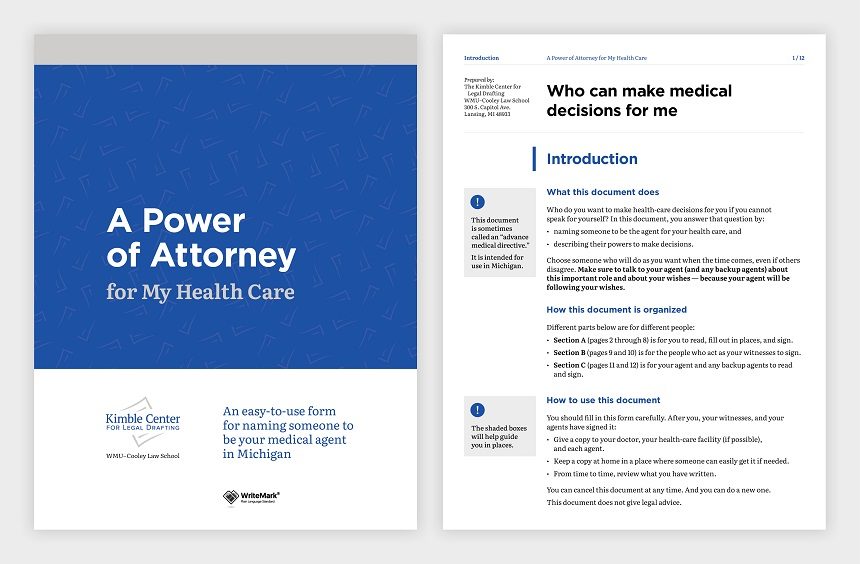
Design elements guide the user through the document. Image by Gusto Design.
Anne-Marie Chisnall May 21st, 2021
Posted In: The WriteMark, WriteMark Holders, WriteMark Plus
Tags: accessibility, ClearMark, Joseph Kimble, Kimble Center for Legal Drafting, Legal documents, plain language, WriteMark, WriteMark Plus
Clarity counts when you’re accountable

Clarity counts for business growth. Image by Micheile Henderson / Unsplash licence
Clarity, honesty, and respect all add up for a long-time WriteMark® holder, Kendons Chartered Accountants.
Financial agreements can be taxing, but Kendons has found a way to communicate complex topics with clarity. They recognise that having the WriteMark® on several of their key business documents supports their business need for clear communication.
Kendons’ business terms and key client letters all carry the WriteMark® seal of approval for clarity. And they have done since 2012.
‘We are straight up. We believe in clarity, honesty, and respect. Making a difference for our clients is our thing.’
An ongoing commitment to keeping things clear
Kendons has recently updated their business terms to include changes in legislation. They wanted to make sure that the updated documents would still meet the WriteMark® Standard. The new content covers complex topics, such as anti-money laundering and non-compliance with laws and regulations.
For the Kendons team, getting to the heart of how the changes might affect their clients is important — but so is explaining the changes as clearly and concisely as possible. Kendons also decided to use the update as an opportunity to check existing text.
The result? Kendons is proud to say that their 2021 terms and key client documents continue to carry the WriteMark® — the quality mark of clear communication that shows you care.
Kendons has also championed plain language over the years as a valued sponsor of New Zealand’s Plain English Awards — they’re a company that’s walking the talk and doing good!
View the register of WriteMark® holders
Anne-Marie Chisnall April 19th, 2021
Posted In: The WriteMark, WriteMark Holders
Tags: accountants, accounting, clients, financial documents
Clearly, it’s still Summer

Summer KiwiSaver helps you on your financial literacy journey. Image by John Dame / Unsplash licence
Forsyth Barr continues its plain language journey with the latest update to the product disclosure statement for Summer KiwiSaver. For the sixth year in a row, Summer KiwiSaver has kept its WriteMark status by continuing to commit to clear communication.
The WriteMark® Plain Language Standard shows readers that a document is easy to read and act on.
Trish Oakley, Head of Summer, explains why they’ve consistently sought the WriteMark® as a hallmark of clarity for their document.
‘We want to show our commitment to plain language so that our investors can easily understand KiwiSaver, and make well-informed decisions about their investments.’
Financial documents change, but they needn’t lose clarity
When a document changes, it needs a quick check-up to make sure it still reaches the high standard demanded by the WriteMark®. This time around, the updates were needed to reflect changes to legislation, tax wording, and processes.
‘Summer’s product disclosure statement is a living document’, says Trish, ‘and as it changes, we’ll continue to seek the WriteMark® tick. That way, we’re supporting our investors in their financial literacy — helping them to understand the language of money.’
Clarity inspires trust
Here at WriteMark® we commend providers like Forsyth Barr.
Write and WriteMark® CE Lynda Harris says,
‘Information about investment affects decisions that have a far-reaching impact. Forsyth Barr has committed to clarity in a field that is known for its complexity. Their members can be confident that Forsyth Barr really does ‘walk the talk’ when it comes to putting customers’ needs first.’
Read Summer’s product disclosure statement
Read our earlier story about Summer KiwiSaver
Read Summer’s article about their commitment to clarity on their website
Find out more about getting a WriteMark® assessment
Anne-Marie Chisnall April 16th, 2021
Posted In: The WriteMark, WriteMark Holders
A plain language love story

Image by Andre Furtado / Pexels licence
We’re head-over-heels for plain language, and we’re always excited when we find others who share our passion. Take Southern Cross Travel Insurance (SCTI): we’ve just awarded the WriteMark® to their new domestic travel policy.
SCTI decided the time was right to offer an insurance policy that would help New Zealanders feel safe and secure when travelling around New Zealand. The WriteMark® shows that SCTI is dedicated to bringing their customers a policy that’s clear and easy to understand.
Nick Bassett, Acting Head of Sales, Product and Marketing, says they wrote the policy with their customers in mind:
We’re committed to providing our customers with excellent service, and knowing what they’re covered for when they buy their policy is incredibly important. The WriteMark® stamp is an endorsement of transparency and integrity, which is why we’re so pleased to have launched our first policy document in plain language, and to have achieved this recognition.
To celebrate, we’ve created a video that showcases everything there is to love about an insurance policy with the WriteMark®.
Your customers deserve a policy that understands them
Insurance should give us peace of mind because we know we have support in times of stress and uncertainty. A policy written with everyday words, short sentences, and useful headings locks in that peace of mind, because you know exactly what you’re covered for.
By writing your insurance policy in plain language, you’re showing that you care about your customers and can think from their perspective. Your transparency will help build their trust.
Learn more about writing insurance policies in plain language
Want to start your own plain language love story? Ask yourself what your reader needs from you, and make sure you deliver it in a way that’s easy to understand.
Insurance cover is complicated, and your readers will thank you for finding a way to lead them through it, without all the jargon. You’ll find lots of helpful tips in our easy-to-use checklist — the Write Plain Language Standard.
Download Write’s free Plain Language Standard
Take our Plain Language Foundations online course
Read our recent blog post on how plain language can help institutions win back trust
Find out more about getting a WriteMark® assessment
Anne-Marie Chisnall September 14th, 2020
Posted In: The WriteMark, WriteMark Holders
Tags: Insurance writing, plain language, policy writing, WriteMark
It’s always clear when it’s Summer

It’s always clear when it’s Summer KiwiSaver. Image by David T / Unsplash licence
Forsyth Barr is celebrating Summer this week. Their Summer KiwiSaver scheme’s product disclosure statement (PDS) is shining bright because it has again met the WriteMark® Plain Language Standard. The Summer KiwiSaver PDS is now in its fifth year of reaching this sought-after confirmation of clarity.
The PDS has new content to reflect both legislative changes and changes to risk indicators for some of the scheme’s funds. Investors can still easily learn about how the Summer KiwiSaver scheme works, its risks, and what rights they have when investing.
Trish Oakley, Head of Summer, is determined to keep the standard of clarity high.
The WriteMark® shows our continued commitment to plain English and to making KiwiSaver easy for our members to understand. That way they can make informed decisions.
Each time the document changes, we’ll make sure it continues to hold the WriteMark®. That shows our commitment to transparency and accessibility.
Investing can be straightforward,
not complex
Like the team at Summer, we think clear writing in financial documents is important to help consumers make good investment decisions. You shouldn’t have to be a financial expert to be able to understand the financial information that affects you.
In a field that’s known for complexity, issuing a really clear statement about your product has far-reaching effects. A financial institution can build trust and goodwill by communicating clearly with its customers. And that’s a bright outlook for all of us.

Lock in clarity by getting the WriteMark® on your documents. Image by Daniel Park / Unsplash licence
Discover resources to help you write clear financial documents
How can you get started on creating a clear financial document? Our evergreen advice is to consider your reader’s needs and put yourself in their shoes.
Think about the purpose of your document. Explore ways you can convey complex information simply, so that people who are not financial experts can understand your writing. You’ll find lots of helpful tips in our easy-to-use checklist — the Write Plain Language Standard.
Download Write’s free Plain Language Standard
Download Write’s free ebook Unravelling Financial Jargon
Check out the Financial Markets Authority’s glossary of financial terms on the FMA website
Find out more about getting a WriteMark® assessment
Anne-Marie Chisnall August 20th, 2020
Posted In: WriteMark Holders
Tags: clear language, financial documents, industry standards, KiwiSaver, Legal documents
Kimble Center’s Power of Attorney goes to the top of its class

Organising a power of attorney document for your healthcare means others can take care of you when you can’t. Image by Bimatshu Pyakuryal / Unsplash licence
We all hope we’ll always be able to make our own decisions about our healthcare. But what if we can’t?
The Kimble Center for Legal Drafting, based at Western Michigan University–Cooley Law School in the US, has published a new Power of Attorney document. People can use the Power of Attorney to set up someone they trust to make decisions about their healthcare if they’re not able to. What’s more, the Power of Attorney is easy to understand — and it’s free to use for US citizens.

Design elements guide the user through the document. Image by Gusto Design.
The Kimble Center’s legal team decided they wanted their new document to be top of its class. So they first asked the members of their advisory board for feedback. Then they applied for another layer of review through the WriteMark assessment process.
The WriteMark® assessment considers purpose, structure, content, language, and design as part of a rigorous document analysis.
Design to support the purpose of the document
The Center engaged the team at Gusto Design to create a design that would support clarity and readability.
Annette Ellis, Creative Director at Gusto, explains:
We worked with the Kimble Center for Legal Drafting to make a complex process clear and easy to understand. The plain language used for the Power of Attorney form is visually supported using design elements that guide the user through the form, making it easy for them to understand and fill out.
Instructions are provided as shaded boxes adjacent to the form fields, providing users with additional information that helps them understand how to fill out the form correctly. This extra guidance is critical to ensure the form accurately captures their wishes.
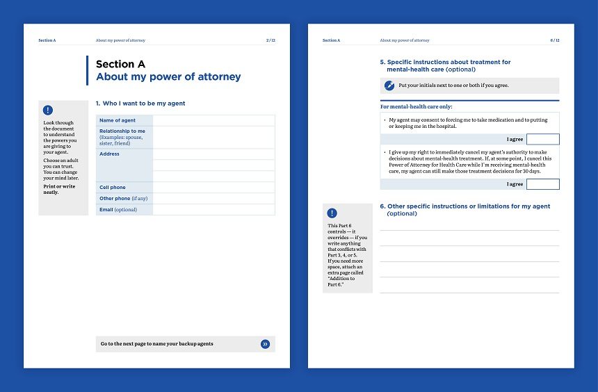
Clear design is critical to ensure the form accurately captures the user’s wishes. Image by Gusto Design
All boxes ticked
With its plain language and simple design, the Power of Attorney for My Health Care goes to the top of its class. It meets all the elements of the WriteMark® Plain Language Standard — and it’s the first document of its type to achieve the Standard.
Joseph Kimble, Distinguished Professor Emeritus at WMU–Cooley Law School, acknowledges the input from the WriteMark® team:
I’m grateful for the invaluable suggestions we received from Anne-Marie Chisnall (a member of our international board of advisers) and then from the WriteMark® assessment team. Those suggestions significantly improved almost every page.
And tested with users too
Since we originally published this story, researchers at Michigan State University have user-tested the Power of Attorney document. The Kimble Center applied recommendations from the user-testing report and did a little rewording and redesigning of the document. With these changes, the Power of Attorney achieved WriteMark® Plus.
WriteMark® Plus is awarded to documents that have reached the WriteMark® Standard and that also undergo user-testing for further fine-tuning.
Find out more about WriteMark® Plus — the ultimate in communication excellence
Legal documents unlike anything that the public has seen before
The Kimble Center for Legal Drafting paves the way for innovative legal documents. This article on the Center’s website describes its origins and goals.
Anne-Marie Chisnall July 31st, 2020
Posted In: The WriteMark, WriteMark Holders, WriteMark Plus
Tags: accessibility, Joseph Kimble, Kimble Center for Legal Drafting, Legal documents, plain language, the WriteMark, WriteMark Plus
Life isn’t fair — but how we act can be

The Fair Insurance Code ticks all the boxes for insurers and consumers. CC-BY-NC-ND
Fairer insurance for all New Zealanders dovetails perfectly with the WriteMark®’s mission of a fairer society where everybody can get the information they need.
This week the Insurance Council of New Zealand published the Fair Insurance Code 2020. The Code helps to build trust and confidence in the insurance industry, which may lead to a fairer financial system for all of us.
The Code safeguards consumers by committing general insurers to:
- act honestly and fairly
- develop, market, and sell insurance products responsibly
- identify and address instances of poor conduct.
A fair code is a clear code
As the Code has reached a high standard for plain language, we’re pleased to say it has also earned the WriteMark®. This means it has a clear purpose, structure, language, and design. Readers can understand and act on the information they need. For example, the Code tells readers at the start what to expect:
…The code describes how your relationship with your insurer should work, including what you need to tell them and how they need to respond.
The code:
- explains what the Fair Insurance Code covers and who it applies to
- describes the responsibilities you and your insurance company have
- explains what should happen when you make a claim or a complaint.
The Code uses straightforward language that talks directly to readers and is easy to understand. Sentences are short and uncomplicated. The writers have also made sure the Code is accessible for readers and speakers of other languages, and have produced a version in New Zealand Sign Language.

A financial band-aid should be fair and clear. Image by Franck V / Unsplash licence
Working together to support consumers
Minister of Commerce and Consumer Affairs Kris Faafoi describes insurance as a critical service that needs to support consumer financial resilience, and not undermine it. When insurers comply with the Code, consumers will find it easier to access financial support when the unexpected happens.
Allowing the insurance industry to self-regulate works with the law and helps to:
- put customers at the centre
- push for culture change in the industry
- set up robust internal processes.
More than the sum of its parts
The Fair Insurance Code has ticked boxes for all 28 elements of the WriteMark® plain language standard. But the Code’s impact and clarity add up to a lot more than that — and that’s fair.
Watch Hon Kris Faafoi introduce the Code
Anne-Marie Chisnall April 7th, 2020
Posted In: The WriteMark, WriteMark Holders